Survey Results (Click to view analytics)
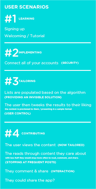
Updated User Scenarios:
Wireframed Scenarios:
(This was done using the Paper App and my iPad. I have sense ordered a stylus to prototype much faster!)
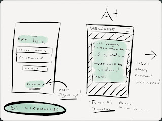
(Scenario 1) Introducing
- Introducing the Application / On boarding - Welcome/Tutorial Screens.
- Signing up / Logging into the App.
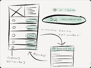
(Scenario 2) Implementing
- Connecting your networks / Looking over your profile.
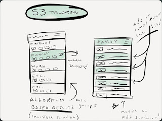
(Scenario 3) Tailoring
- Tailoring / Editing your algorithm established connections. User control.
- For example the app has collected the networks of all of your individual family members.
- They can then select only the members of their family they want to closely follow.
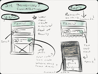
(Scenario 4) Benefiting / Contributing
- Viewing the content of those now tailored master feed of "All" of their connections (or just a category like "Family", or "Favorites".
- Experimenting with the different ways content in the feed can be denoted as what source its from: ie. Facebook, Twitter, Tumblr, Linkedin, etc. I'm planning on small icons currently.
- Replying to that content in a quick, and familiar way. Experimenting with popovers, and as shown below slide to reveal menus in a horizontal and vertical way.
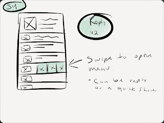
Reply V.2
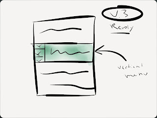
Reply V.2
App Studies of Brewster, and Supply. Both utilize a series of unique but sensible hidden or collapsable menu features. Something I've been struggling with integrating into my own designs.
Svpply is a great source of inspiration regarding its flat design style, subtle use of color and clear settings and roll over navigation interface.
 Brewster is a tailorable contact app which hits close to home regarding my app concept but fails to deliver content outside of contact information and links. Its ability to manage contacts and supply data from existing networks was fascinating and I believe that I see where I can improve on its concept with my own.


.JPG)
.JPG)


1 comment:
looking good. in scenario three (tailoring): be mindful of how to manage complex connections. ex: someone that is a friend, a work colleague and a ____.
scenario 4 needs to be built out, but i'm assuming you know this. dive deep here.
Post a Comment