Showing posts with label INFORMATION ARCHITECTURE. Show all posts
May 11, 2012
May 7, 2012
Flock Wireframes & Process
Wireframes
Wireframes Continued
Possible Flock Logo.
Near Final Wireframes.
Experimental Keynote Order.
Early events screen.
Early details screen with the line work before any use of low opacity layering.
Early profile screen before the lines between sections were removed and ranger was brought in.
Early home screens using alerts function.
Pre-final loading screen.
Texture got pulled out.
Early Events Screen - First time sectioned off RSVP.
Early profile screen.
-----------------
FINAL SCREENS
May 6, 2012
Flock iPhone Application
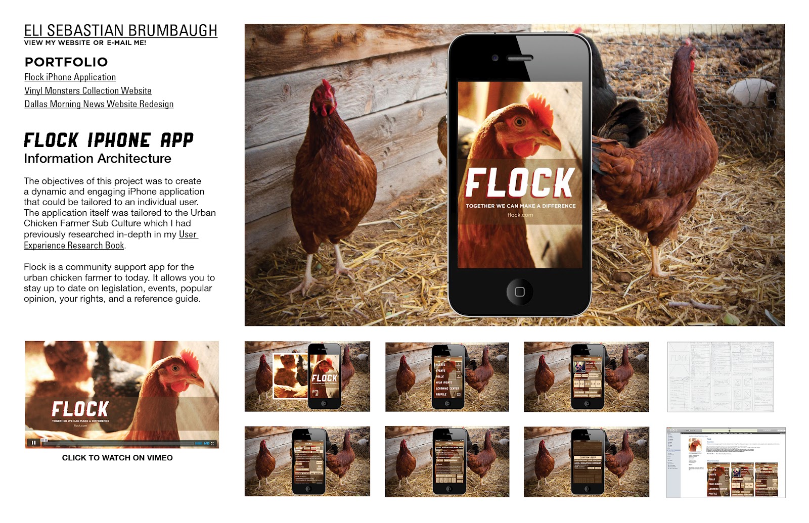
Flock is a community support app for the urban chicken farmer to today. It allows you to stay up to date on legislation, events, popular opinion, your rights, and a reference guide.
• Stay informed of local legislation meetings in your area to quickly mobilize with the Alerts feature.
• Create and register to attend events organized by skills and experience in which you can chose to be the teacher or the student.
• Give and receive feedback on popular opinion in your area using the Polls.
• Have access to a legal reference guide to always have your rights as an urban chicken farmer at your finger tips.
• Contribute to and benefit from the user created Learning Center, a database of urban chicken farmer necessities.
• Customize your user profile to reflects your areas of expertise, experience, and dedication.
April 27, 2012
Flock Adjustments
Keynote Order:
iPhone w/icon displayed.
Flock loading screen.
Outline loading screen comparison to show what it would look like for a new user.
Home Screen.
Profile (user view) - Only the user see's their own profile this way?
Profile - Edited by user / Updated experience level.
Events. - User picks an event to read about.
Events Details.
RSVP Conformation Popup.
Context shot - Person at an urban chicken meet up where they mention that everyone should rsvp for the events / specific workshop upcoming about local legislation.
iTunes might be at the end.
Things to build out still:
- iTunes Page
- Context shot
- iPhone screen
- Outline loading screen
April 23, 2012
10 Principles of Mobile Interface Design
http://www.netmagazine.com/features/10-principles-mobile-interface-design
Just a little find and share about some good mobile design tips.
April 22, 2012
Flock Adjustments
First three rounds of designs:
Next Class:
As many screens finished as possible. Chip away at it. Show progress.
Keynote Order:
Context Shot: Person at an urban chicken meet up where they mention that everyone should rsvp for the events / specific workshop upcoming about local legislation.
iTunes Store w/ three screens and icon.
iPhone w/icon displayed.
Flock loading screen.
Outline loading screen comparison to show what it would look like for a new user.
Home Screen.
Profile (user view) - explains the large year buttons being there. Only the user see's their own profile this way? Maybe its fine but this is an option.
Profile - edited by user / updated experience level.
Events.
Events Details.
RSVP Conformation Popup.
Context Shot: Maybe at the end.
iTunes might be at the end.
Things to build out still:
Icon, iTunes Page, Context shot, iPhone screen, Outline loading screen, rsvp conf screen.
Adjustments to Flock:
Buttons are too small in many places. The year range for example. Remember Homer Simpson fingers.
Profile Screen - Remember you can scroll down to view more of the profile and decompress the rest of it.
Use the same image in every background until finished. That is the image created by the person.
BKGD change is now in the profile screen.
Show some kind of blank on how it would look (IF) my user persona wasn't an pre-existing user.
RSVP button now comes with a conformation pop up. The presentation ends after this page with a image of it being used at a urban chicken meet up that they found through the application. This will show how it fulfilled a purpose.
I will be moving forward with this one because of its style and color pallet that better lends itself to the sub-culture.
Next Class:
As many screens finished as possible. Chip away at it. Show progress.
Keynote Order:
Context Shot: Person at an urban chicken meet up where they mention that everyone should rsvp for the events / specific workshop upcoming about local legislation.
iTunes Store w/ three screens and icon.
iPhone w/icon displayed.
Flock loading screen.
Outline loading screen comparison to show what it would look like for a new user.
Home Screen.
Profile (user view) - explains the large year buttons being there. Only the user see's their own profile this way? Maybe its fine but this is an option.
Profile - edited by user / updated experience level.
Events.
Events Details.
RSVP Conformation Popup.
Context Shot: Maybe at the end.
iTunes might be at the end.
Things to build out still:
Icon, iTunes Page, Context shot, iPhone screen, Outline loading screen, rsvp conf screen.
Adjustments to Flock:
Buttons are too small in many places. The year range for example. Remember Homer Simpson fingers.
Profile Screen - Remember you can scroll down to view more of the profile and decompress the rest of it.
Use the same image in every background until finished. That is the image created by the person.
BKGD change is now in the profile screen.
Show some kind of blank on how it would look (IF) my user persona wasn't an pre-existing user.
RSVP button now comes with a conformation pop up. The presentation ends after this page with a image of it being used at a urban chicken meet up that they found through the application. This will show how it fulfilled a purpose.
April 15, 2012
April 9, 2012
April 6, 2012
April 2, 2012
Vinyl Monsters Update
Updated homepage with new layout showing the merger of the about section with an additional area for calling sorting methods.
March 30, 2012
March 26, 2012
Vinyl Monsters Progress Update
Home Page
Infographic #1
Infographic #2
Infographic #3
Infographic #4
Infographic #5
Infographic #6
Infographic #7
March 23, 2012
Designer Toy Collection Website Three Directions
Direction #1 - Vinyl Monsters
"A collection of creative creatures"
Vinyl Monsters, utilizes a roll over navigation that shifts from archer regular to bold on mouse over. The homepage features the complete collection of vinyl toys heads alone. On mouse over the full body would appear. This theme is also serving as a test for use of the drop shadow on my vectors and some aspects of information display for example the collector information. My header typeface is Spring. The little monster image in the header is taken from the face of the Superdeux Dunny which happens to be the most popular of those in my collection.
Note for Marty: Personally I'm really questioning the use of the heads alone for a roll over. I think a drop shadow on mouse over or something simular might be more visually pleasing and not as harsh. I really like the use of drop shadow but I think I just have to be really careful with the amount of it that I use. Thanks for letting us submit the work this way so we can attend the workshop. I'm looking forward to your feedback.
Direction #2 - Plastic Planet
"A collection of designer toys"
Home screen. This particular concept does not utilize a roll over image function like the concept below.
Toy profile with collector data and infographic.
Direction #3 - Unboxed Ltd. (Unboxed Limited)
"Unleash your vinyl side"
Unboxed Ltd. is a direct relation to the unboxing of a designer toy the first time you purchase and open the box. Typically designer toys come in blind assortments which makes certain ones much rarer than others. Which is why included limited. This is much of the appeal of designer toys. The hunt. Hence the limited colors. Most sites that I have researched in the process of this project utilize a formula some what simular to this. Lots of white space and black text. Max contrast with the bright imagery.This concept is supposed to be the tough guy / i'm a bad ass kind of concept. You have to drink a red bull to even open the page. Maybe I can do that through HTML5 or augmented reality... haha.
Home page shows each toy's head
Roll over state shows full body.
Toy profile, with facts, and infographic.
Subscribe to:
Posts (Atom)


