
Showing posts with label TYPOGRAPHY IV. Show all posts
Showing posts with label TYPOGRAPHY IV. Show all posts
May 6, 2012

April 27, 2012
April 22, 2012
Keynote Adjustments Progress
We are currently working on implementing these new screens:
Our Goals.
Typeface selection - During research.
Testing process.
Issues we resolved.
iPad app as a design solution.
Wireframing.
iPad Context with icon.
The new screens from before last presentation and the last / near final:


April 11, 2012
iC Type Adjustments
Moving Forward:
Keynote / Prototype Notes:
iPad Keynote on the iMac in studio.
Adjustments in the application:
Remove the optometrist option because of possible trust issues.
Moving forward:
Keynote / Prototype Notes:
iPad Keynote on the iMac in studio.
Adjustments in the application:
Remove the optometrist option because of possible trust issues.
Moving forward:
- Color the UI.
- Finalize type.
- Icon System.
- Video upload and read to drop into the keynote.
- Images of the content.
- Social feed images.
April 7, 2012
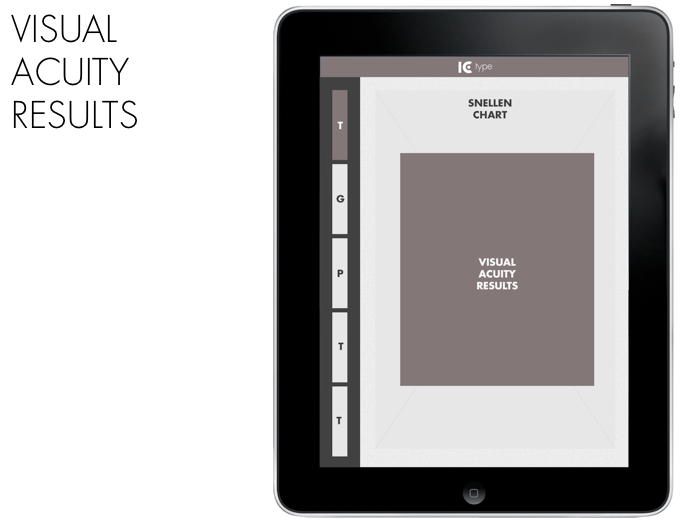
iC Type - UI Wireframes
Updated brand mark with med blood absorption color.

Testing out new pallet possibilities.




March 21, 2012
iC - Preparation for design / App functionality.
Branding & Packaging Components:
Logo - iC (I see) branding. Centered Size: 3"x3"
Start up Screen - iC logo w/ sound mark.
Background - Depth of field shifting gray scale.
UI - Clean, Large
No rotation.
Sections:
*Where to find an optometrist. Using the GPS.
* The different kinds of eye issues that one can have.
* Advice - Taking care of your eyes, have regular eye tests, take regular breaks, invest in quality lenses, ask for personal lenses,
* About the application.
Things to avoid:
Static or moving imagery outside of the beginning.
Small UI.
Warnings:
* Add note about how this is not a professional method of testing your eye sight. Waver.
* Terms & Conditions.
Research Notes:
Visual Acuity
Astigmatism
Duochrome
Colour Test
Links:
http://3sidedcube.com/#work/vision-test-2
http://indesignsecrets.com/turning-indesign-files-to-ipad-apps.php
Logo - iC (I see) branding. Centered Size: 3"x3"
Start up Screen - iC logo w/ sound mark.
Background - Depth of field shifting gray scale.
UI - Clean, Large
No rotation.
Sections:
*Where to find an optometrist. Using the GPS.
* The different kinds of eye issues that one can have.
* Advice - Taking care of your eyes, have regular eye tests, take regular breaks, invest in quality lenses, ask for personal lenses,
* About the application.
Things to avoid:
Static or moving imagery outside of the beginning.
Small UI.
Warnings:
* Add note about how this is not a professional method of testing your eye sight. Waver.
* Terms & Conditions.
Research Notes:
Visual Acuity
Astigmatism
Duochrome
Colour Test
Links:
http://3sidedcube.com/#work/vision-test-2
http://indesignsecrets.com/turning-indesign-files-to-ipad-apps.php
March 9, 2012
Progress Report / Four Typeface Comparison & Found Signage Example
First steps towards our visual direction now with the about section.
My results next to one another. Something more comprehensive will be posted soon.
I'm sorry about the quality of this image. I had to photograph it as my file was lost in a photoshop crash.
March 7, 2012
Bodoni Typeface Test vs Helvetica / Futura

A visual comparison of Jessi Wilson's typeface testing with Bodoni on top, Helvetica in the middle, and Futura at the bottom.
We will be continuing testing regarding Bodni, Comic Sans, and if we can attain it Dyslexie.
February 29, 2012
Helvetica Bold vs Futura Bold Research
This is a visual comparison of Helvetica Bold and Futura Bold. Moving forward we will be retesting each person from before for a group comparison. With those results we will be creating a charted out comparison of the visual clarity of each typeface.
February 16, 2012
Data Gathered by 2/15 Check Point & Update
This is the collection of data we have collected thus far. Moving forward we will continue to accumulate data. Preferably we will test everyone in design with corrected vision.
Next we will be finding connections, and establishing the rules in which we will visualize the data. Once approved we will move forward into wire framing and skinning.
Further Reading:
Eli - Visual Acuity Results:
Near / Snellen Card:
R: N5
L: N5
Far / Snellen Chart:
R: 20/70
L: 20/100
Michael - Visual Acuity Results:
Near / Snellen Card:
R: N18
L: N18
Far / Snellen Chart:
R: 20/200
L: 20/200
Jessie Ren - Visual Acuity Results:
Near / Snellen Card:
R: N5
L: N5
Far / Snellen Chart:
R: 20/70
L: 20/70
Ian Spaeth - Visual Acuity Results:
Near / Snellen Card:
R: N48
L: N48
Far / Snellen Chart:
R: 20/200+
L: 20/200+
R: N5
L: N5
Far / Snellen Chart:
R: 20/70
L: 20/70
Ian Spaeth - Visual Acuity Results:
Near / Snellen Card:
R: N48
L: N48
Far / Snellen Chart:
R: 20/200+
L: 20/200+
Michael Jumper - Visual Acuity Results:
Near / Snellen Card:
R: N24
L: N36
Far / Snellen Chart:
R: 20/200+
L: 20/200+
Ivan Alonzo - Visual Acuity Results:
R: N24
L: N36
Far / Snellen Chart:
R: 20/200+
L: 20/200+
Ivan Alonzo - Visual Acuity Results:
Near / Snellen Card:
R: N6
L: N8
Far / Snellen Chart:
R: 20/70
L: 20/70
Jessi Wilson - Visual Acuity Results:
Near / Snellen Card:
R: N8
L: N5
Far / Snellen Chart:
R: 20/100
L: 20/70
McKenzie Marston - Visual Acuity Results:
R: N6
L: N8
Far / Snellen Chart:
R: 20/70
L: 20/70
Jessi Wilson - Visual Acuity Results:
Near / Snellen Card:
R: N8
L: N5
Far / Snellen Chart:
R: 20/100
L: 20/70
McKenzie Marston - Visual Acuity Results:
Near / Snellen Card:
R: N6
L: N5
Far / Snellen Chart:
R: 20/20
L: 20/20
February 10, 2012
Moving Forward
See an optometrist to learn about anything we missed in our own research.
We will be asking them if there is a software that they use to calculate prescriptions. This will allow us to better formulate our data.
Explore the UI of the proposed application on the iPad setting.
Sort out the data and how it can be visualized.
We will be testing our experiment with Jessie Ren, Jessi Wilson, Jumper, and Ivan.
We will be asking them if there is a software that they use to calculate prescriptions. This will allow us to better formulate our data.
Explore the UI of the proposed application on the iPad setting.
Sort out the data and how it can be visualized.
We will be testing our experiment with Jessie Ren, Jessi Wilson, Jumper, and Ivan.
Experimentation Results / Eli & Michael 1ft - 12ft
Eli - Visual Acuity Results:
We discovered quite a variance between our vision even thought we are both near sighted.
Near / Snellen Card:
R: N5
L: N5
Far / Snellen Chart:
R: 20/70
L: 20/100
Michael - Visual Acuity Results:
Near / Snellen Card:
R: N18
L: N18
Far / Snellen Chart:
R: 20/200
L: 20/200
Further Reading:
February 8, 2012
How I See The World - Major Project Update / Research
The Question:
How does nearsightedness, farsightedness, and a stigmatism affect the typographic form at different set distances? Can there be a typeface designed to correct optical distortions? Can the data be used to accurately replicate the optical blur and distortion in other situations? Can this information then be put into application form using Apple's iPad in which the user can share their custom tailored vison experiment with others
Concept:
The user holds the iPad and snaps a photo of anything around them they want to use for the test. They then remove their corrected vision ie. glasses / contacts and then they look at that same object and match the level of blur that they saw without their glasses after putting them back on using the iPad application. The app would utilize sliders to interface with the iPad and make the corrections. Next the iPad uploads (online calculations) or crunches (internal process) the data and then the user would get their personalized results. These results can then be shared with friends and family or other users to show and compare the way that you each see the world. The user you send your to data can then take a different photo and plug in your data or select your results (or profile if it saves friends profile data) and view the photo that they took with your same vision results.
Social Integration:
The user will be able to share their personalized vision "settings" with other users who also have the app. This would allow us to show a friends list of sorts or profile list that the user could pick through to try out several friends settings. Consider it a modern way to take off your friends glasses. So that other people can see the world through their eyes.
The user has the option of printing off their own personalized set of letterforms based on their vision settings. It could spell out their name or whatever else they wanted it to say. This could be e-mailed to the user or a friend. It could also be printed off using Apple's Air Print system. There could also be an online gallery that you and your friends can upload to and share online with.
Prototype:
The user holds the iPad and snaps a photo of anything around them they want to use for the test. They then remove their corrected vision ie. glasses / contacts and then they look at that same object and match the level of blur that they saw without their glasses after putting them back on using the iPad application. The app would utilize sliders to interface with the iPad and make the corrections. Next the iPad uploads (online calculations) or crunches (internal process) the data and then the user would get their personalized results. These results can then be shared with friends and family or other users to show and compare the way that you each see the world. The user you send your to data can then take a different photo and plug in your data or select your results (or profile if it saves friends profile data) and view the photo that they took with your same vision results.
Social Integration:
The user will be able to share their personalized vision "settings" with other users who also have the app. This would allow us to show a friends list of sorts or profile list that the user could pick through to try out several friends settings. Consider it a modern way to take off your friends glasses. So that other people can see the world through their eyes.
The user has the option of printing off their own personalized set of letterforms based on their vision settings. It could spell out their name or whatever else they wanted it to say. This could be e-mailed to the user or a friend. It could also be printed off using Apple's Air Print system. There could also be an online gallery that you and your friends can upload to and share online with.
Prototype:
We will be using the iPad to create our prototype of how the application would function with the results of our experiment. Hypothetically they would be created using iPad rather than MBP.
Functioning Details:
The images will be replicated using photoshop via MBP. (we tried the iPad & iPhone PS Express but it lacked any blur / scripting capability)
Functioning Details:
The images will be replicated using photoshop via MBP. (we tried the iPad & iPhone PS Express but it lacked any blur / scripting capability)
Typefaces Explored:
We picked different typefaces to test with (ones that people interact with on a daily basis e.g.
We picked different typefaces to test with (ones that people interact with on a daily basis e.g.
- Helvetica
- Interstate
- Futura
- Trade Gothic
- Garamond
- Univers
Interesting Fact: "Helvetica is everywhere. It is the standard typeface of hospital signage systems, medicine labels..." -http://www.frieze.com/issue/article/typecast/
Technical Details:
1-3ft farsighted
6-12ft nearsighted
The stigmatism would be a radical.
Using these mesures we can show the near and far side.
Consider the zero point at 6ft. Farsightedness being -6 and nearsighted being +6
Technical Details:
1-3ft farsighted
6-12ft nearsighted
The stigmatism would be a radical.
Using these mesures we can show the near and far side.
Consider the zero point at 6ft. Farsightedness being -6 and nearsighted being +6
Final Artifacts:
The iPad application.
The image data.
A poster of all of the data visualized.
February 5, 2012
Testing The Waters

The Questions: How does nearsightedness, farsightedness, and astigmatism affect the typographic form at different distances? Can there be a typeface designed to correct optical distortions? Can the data be used to accurately replicate the optical blur and distortion in other situations?
Pick different typefaces to test with (ones that people interact with on a daily basis e.g. Helvetica, Interstate, Futura, Trade Gothic, Garamond, Univers). "Helvetica is everywhere. It is the standard typeface of hospital signage systems, medicine labels..." -http://www.frieze.com/issue/article/typecast/
Creating a checklist with multiple scenarios for the individuals eyesight and the results for each distance and typeface tested.
Interview potential victims. Record their specific vision type.
Conduct experiment.
Try to ask the subject to replicate the type with a camera for blur and a computer for distortion.
February 3, 2012
Concepts for Type IV Project
This is How I See the World (collaboration w/ Michael)
1) The Question: How does a person’s particular near or farsightedness affect the typographic form at different distances? Proposal: Gathering a group of people and placing type at a number of set distances. Having each person identify the affect of “poor vision” on the type at each distance, by adjusting the focus on a camera. We would then identify the amount of blur for each vision variant and match the results in photoshop to produce similar affects on other typography and imagery. The result could be represented as a poster and collected information could be organized into info-graphic material. Also an animated reconstruction of each subjects experience with the type.
2) Computer generated / randomly generated based on input to questions answered by survey by the user. Could I tie in an iPad app or iPhone app into this. Create a game or program that people could impute their data and get a letter form created for each person in their friends and family using their first initial possibly? They would then flesh out the entire alphabet and they could create words or sentences and print them off via Apple's AirPrint of send to e-mail.
3) Organic letterforms that decompose. Time-lapse or video of the process. This would take place in an aquarium with ants. The ants would. The video or time-lapse would be played backwards to make it appear as if the ants had built the typography.
1) The Question: How does a person’s particular near or farsightedness affect the typographic form at different distances? Proposal: Gathering a group of people and placing type at a number of set distances. Having each person identify the affect of “poor vision” on the type at each distance, by adjusting the focus on a camera. We would then identify the amount of blur for each vision variant and match the results in photoshop to produce similar affects on other typography and imagery. The result could be represented as a poster and collected information could be organized into info-graphic material. Also an animated reconstruction of each subjects experience with the type.
2) Computer generated / randomly generated based on input to questions answered by survey by the user. Could I tie in an iPad app or iPhone app into this. Create a game or program that people could impute their data and get a letter form created for each person in their friends and family using their first initial possibly? They would then flesh out the entire alphabet and they could create words or sentences and print them off via Apple's AirPrint of send to e-mail.
3) Organic letterforms that decompose. Time-lapse or video of the process. This would take place in an aquarium with ants. The ants would. The video or time-lapse would be played backwards to make it appear as if the ants had built the typography.
January 29, 2012
Project Brainstorming
Project Brainstorming
1) Plant based typeface created using wire mesh framework. The type would be grown using the aquatic moss a rapidly growing plant grown in an aquarium. Using a photographic time-lapse it would grow overtime from the base of the letter forms or from one end to another.
2) Plant based typeface grown using surface plants that starting out lust and green will shrivel down small to the point of bare sticks.
3) Organic letterforms that decompose. Time-lapse or video of the process. This would take place in an aquarium with ants. The ants would. The video or time-lapse would be played backwards to make it appear as if the ants had built the typography.
4) Computer generated / randomly generated based on input to questions answered by survey by the user. Could I tie in an iPad app or iPhone app into this. Create a game or program that people could impute their data and get a letter form created for each person in their friends and family using their first initial possibly? They would then flesh out the entire alphabet and they could create words or sentences and print them off via Apple's AirPrint of send to e-mail.
5) Have a diverse group of people unknowingly to one another each draw their own interoperation of the letter forms. The differences in the letter forms will show diversity in the creativity and individuality of people of many races. The final artifact could spell out "DIVERSITY"
Documentation idea: Have each person take a picture with the letter form with it before they send or submit it to me to show that diversity.
1) Plant based typeface created using wire mesh framework. The type would be grown using the aquatic moss a rapidly growing plant grown in an aquarium. Using a photographic time-lapse it would grow overtime from the base of the letter forms or from one end to another.
2) Plant based typeface grown using surface plants that starting out lust and green will shrivel down small to the point of bare sticks.
3) Organic letterforms that decompose. Time-lapse or video of the process. This would take place in an aquarium with ants. The ants would. The video or time-lapse would be played backwards to make it appear as if the ants had built the typography.
4) Computer generated / randomly generated based on input to questions answered by survey by the user. Could I tie in an iPad app or iPhone app into this. Create a game or program that people could impute their data and get a letter form created for each person in their friends and family using their first initial possibly? They would then flesh out the entire alphabet and they could create words or sentences and print them off via Apple's AirPrint of send to e-mail.
5) Have a diverse group of people unknowingly to one another each draw their own interoperation of the letter forms. The differences in the letter forms will show diversity in the creativity and individuality of people of many races. The final artifact could spell out "DIVERSITY"
Documentation idea: Have each person take a picture with the letter form with it before they send or submit it to me to show that diversity.
Subscribe to:
Posts (Atom)
