Showing posts with label COLOR FORM PRODUCTION. Show all posts

September 27, 2010

Pantone + / - Emotional Responses

Bright Red 186 - Angry, Frustrated, Hot, Radiant

Vibrant Orange 1585 - Excited, Glowing, Vibrant

Bright Yellow 116 - Passionate

Earth Brown 438 - Safe, Protected, Secure, Hidden

Deep Blue 2747 - Sad, Worried, Depressed, Uncertain

Chartreuse Green 584 - Curious, Forgiving, Sincere 

Blue Purple 267 - Crestfallen, Melancholy 

Charcoal Gray 425 - Worn, Tired, Dying

White - Scared, Cold

Black - Vapid, Concerned, Afraid

Color Study

Photo Color / Studies - Books in Enviroments

Here are my first round of photographs for our photo color / studies. I will be narrowing these down after I take many more into a cohesive collection. 

My theme is Books in Environments. 

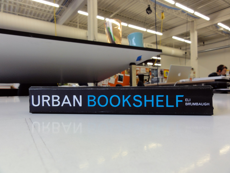
The books I purchased from half price books particularly for their cover colors.

These are mostly outdoors but I plan on taking them into cafe's, and other kinds of stores as well. 

I plan on burying, and suspending some in different color settings. 

POST CRIT: Remember each page is a different color relationship. Get rid of the covers and print out color sheets to replace them with. 8 Covers total now. Watch for cropping in images when I shoot them. Make sure backgrounds are effective as part of the composition and part of the color wheel. 


September 20, 2010

Color Harmonies

The following are the basic color harmonies on the color wheel. This has already come in quite a bit on our current project that we're working on with color and photographs now. 

My theme is Book's with a focus primarily on their covers set in the outdoors. 

A complementary example of my theme would be A red book hanging in a green tree. 

Color Wheel with complementary color scheme
Complementary
Colors that are opposite each other on the color wheel are considered to be complementary colors (example: red and green).
The high contrast of complementary colors creates a vibrant look especially when used at full saturation. This color scheme must be managed well so it is not jarring.
Complementary colors are tricky to use in large doses, but work well when you want something to stand out.
Complementary colors are really bad for text.

complementary color scheme

The rest of this post is below the break. Please click "read more".

September 12, 2010

IBM Logo Experiment

I chose the IBM logo for this project for a few different reasons. The first of which would be because I was interested in studying the work of Paul Rand who created such well known corporate identities as IBM, ABC, UPS, Enron (LOL), Westinghouse, and NeXt Computers (Steve Job's Company after leaving Apple). The second being the interesting shift in design theory from Modernism into Postmodernism in which Paul Rand was an out spoken critic of postmodernist theory and aesthetic in design.

Some more info about Paul Rand: Wikipedia, and Paul-Rand.com

Here are a few examples of what I put together experimenting with Illustrator. A program I have a lot of respect for which I have little experience with thus far other than using it for live tracing gig poster designs. 


August 29, 2010

Experimental Versions of IBM Logo


Experiment using the Pucker Tool in Illustrator.


Experiment using the Swirl Tool in Illustrator.