Showing posts with label VISUAL COMMUNICATION II. Show all posts

May 13, 2011

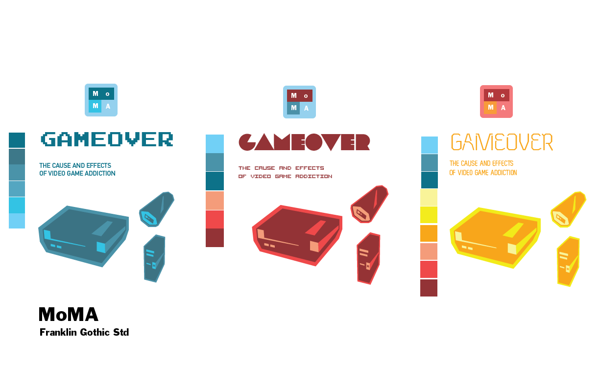
Smithsonian "Gameover" Exhibit Branding Book Final

Smithsonian "Gameover" Exhibit Branding Book


Front Cover

iPhone Spread

iPhone Spread Partial

NES Journal

NES Journal Outside

NES Journal Inside


April 25, 2011

Smithsonian Exhibit / iPhone App Skins & Features + Visual Identity Update

Navigation Context:
 Home Icon, Application Menu (Horizontal & Vertical), and Subcategory Menu. 


Smithsonian Website Banner + Banners in context infront of the Smithsonian. 

Gift Bag + T-shirts

iPhone Application + Banners out of context

April 22, 2011

Smithsonian Exhibit / iPhone App Skins & Features + Visual Identity

Application Features:

  • Gift Shop Integration - Purchase before your visit or during your visit to the Smithsonian through the Game Over Exhibit Application and shop without worrying about or lugging around your purchases until your ready to leave.
  • Google Goggles Integration - Simply tap the Google Goggles glasses icon to open up a camera sub-program that when pointed at any display in the exhibit will pull up additional factual data for your enjoyment.
  • Social Networking Integration - Tap the Share button to seamlessly post to your Facebook Wall, Tweet, or send an E-mail to share your experience with others with a simple popup verification and menu screen. After message has ben sent the screen will automatically close. 
After crit today this is the set that I will be moving forward with. I will be making a third iPhone screen to display the subcategories within my app. Along with this subcategory I will implement the use of Google Goggles to display information about the attractions within the museum using your smart phone. You simply open the application with the tap of a button and the application scans the display simply by opening the app.

I have included a video of Google Googles in action below.
Set #2

Set #2
Set #3

Set #3

Google Googles Implementation Example. 

Style Guide For Each Set

April 11, 2011

Applied Identity: Museum Exhibit Titles & Concepts

Videogame Addiction
Exhibit based on the cause and effects of videogame addiction.

Geeks and Technological Change: Social Network Shapers
Exhibit based on the massive effects "Geeks" have had on shaping the technological progression of modern culture.

The History of Gaming Culture
Exhibit based on the roots of gaming culture. Where it started and where it is now.

First Mind Map:


April 10, 2011

Two Symbols in One - Reading & Responce


The AdamsMorioka's new blog has really struck home on this one. I have really felt that same trend that they describe as being a problem. Naturally my first solutions to some design problems have been to jump directly into depiction of the scene or to come to the first logical solution. Since being here at KCAI I've been working to stop this habit that creates possibly attractive but less intelligent work that could be created with more research, and thoughtful process. 

The fused metaphor formula that Lou Danziger taught them works in the way that symbol A and symbol B is combined to create a new and better result. So you start with making a list of every symbol. The example they used summer in Los Angeles: Summer; sun, beach, beach umbrella, swimming pool; Los Angeles; freeway, oranges,  palm tree, etc. After this they combine the two. If you create different combinations of symbols rather than scenery to create a intelligent and memorable design solution. 

April 8, 2011

Modern Geek Culture: Final Infographic Poster Deliverable

I've always known that I enjoyed infographics as a viewer and a participator but to really sit down and work on creating a few for our cultures of choice was a real eye opener. Sure I can say I enjoy them, but making them has given me an entirely new respect for the profession. 

This was my first experience creating infographics and I have to stay it has a certain Je ne sais quois thats intoxicating. When I was working on these there is a certain level of freedom in how to visualize the data. I mean of course it had to be legible but once I got past the standard layout ideas that I had drilled into my skull in public school I realized it could be pushed a lot further. Looking into people like David McCandless really helped in this process. 

Next time around I want to cut through the iterations faster and make my visuals striking as fast as possible. Working on projects like this really, really reinforce the strength of design evolution.  I'm really excited to see how the rest of this project evolves out. 


2nd 18x24 & final infographic poster
This version was a lot lighter in feel and more refined.

old images removed for google drive space. 


March 17, 2011

Infograph Brain Storming

Energy Drink:
Lethal caffeine quantities.
Sleeping problems.
Health problems as an effect.
College students and caffeine.

NES:
Video game Collections.
Video game competition.
Video game systems over time.
Console wars over last 30 years.

Console wars over last 5 years. 

CPU:
Overall computer users in the world. 
Internet culture. 
Mac vs. PC.
Internet penetration world wide. 
Moore's law of technological growth. 

Flash Drive: 
Data rates cost past vs present. 
Data rates according to Moores law. 
Size changes over time. 
Culturally iconic drives.

Glasses:
Glasses resurgence.
Cultural trends.
Pop culture relationship.
History until now. 

Books:
Sci-fi books top 10.
Major authors.
Sci-fi books that have predicted future tech.
Terminology coined in science fiction novels. 

March 9, 2011

Icon Set Final Summation


In my Geek Culture icon set I embodied the essence of the Modern Geek. In this set I wanted to communicate geek culture but also the geek of today. Technologically adapt, conscious of trends, and styles. Geek is no longer a bad word and I want this set to reflect that. 

By using hard lines and jagged edges I wanted to portray bold, cutting edge stylistic choices. My color pallet reflecting the bright color saturated world of over powered computers, flashy videogame consols, and peripherals. Also by referencing some key historical geek icon senses I paid hommage to the Zelda Tri-force, and the Nintendo Entertainment System. 

I worked to keep the icons cohesive and legible many times over. I had a lot of problems working with the angles that a lot of my images had taken in relation to one another. I hope to have solved this issue with changing the perspective of the icons and giving them perspective change. 

In this project I learned that I need to be very careful in selecting images to work with when in the creation of icons. I know now that I need to focus on building a better understanding perspective grids prior to undertaking a project. All and all I am pleased with the project and I am excited for the next step. 

Icon Set - Color Progression


After last critique I have decided to merge my positive/negative 3 color composition with my 2 color outline composition. Above the 3 color outline is the result.

I will have five sets total when completed.

Icon Set - Color Round #1

First Set of Colored Icons


Icon Color Pallet


February 24, 2011

PJ 2 Icons - First Round

Nintendo NES System (This is being edited with a more stylistic approach. See the glasses below for an example)

Black Glasses (This is the basis for the revisions to my other images)

USB Flash Drive (Sharper angles are being added)

TV (New angles are being added)

Energy Drinks (This will be replaced)

Book (This will be replaced)

February 10, 2011

Design Archeology - Geek Culture - Final Book (Updated)

Modern Geek Culture & Values

Modern Geek Culture, places high value on intellectual pursuits, technological exploration, collection, and celebration of material objects that pick their curiosity.

Such as a wide array of objects ranging from the creation of custom designed computers to stress relief outlets in the form of video games, and science-fiction novels.

Modern Geek Culture also champions the idea of the individual. Someone who is unwilling to follow trends, and who instead focuses on things that interest them personally at times even to the point of bordering on obsessive.


Layout Concept

My layout has two shapes. Every spread except for Gamer Chairs, and TV's are in a diamond shape <> to varying lengths and widths. Gamer Chairs, and TV's are in a cross layout + to break up the visual progression through the book.

The images in my layout goes from larger to small based on the popularity of the items on each spread.

The layout also represents the introspective nature of the Modern Geek by bringing the items that represent them into the center of the composition as one would bring in the things that represent them and support them emotionally in a personal place of safe keeping.