Our wayfinding system focuses on KCAI’s “energetic”, “active” and “artistic” spirit through dynamically shaped signage, based on a triangular-shaped grid system. This system gives each sign an interesting, organized structure, but allows for each sign to be individual and unique from the rest. The signs have an overlapping, oragami-like structure that alludes to the unique students evolving and transforming through their school years here. Integrated into the signs are random, transparent pieces that are made up of many small triangles. This suggests at them being a work in progress, as both the students and their art are always growing.
February 28, 2013
PJ 1 Wayfinding Final
Our wayfinding system focuses on KCAI’s “energetic”, “active” and “artistic” spirit through dynamically shaped signage, based on a triangular-shaped grid system. This system gives each sign an interesting, organized structure, but allows for each sign to be individual and unique from the rest. The signs have an overlapping, oragami-like structure that alludes to the unique students evolving and transforming through their school years here. Integrated into the signs are random, transparent pieces that are made up of many small triangles. This suggests at them being a work in progress, as both the students and their art are always growing.
February 27, 2013
Degree Project - Week 5
Survey Results (Click to view analytics)
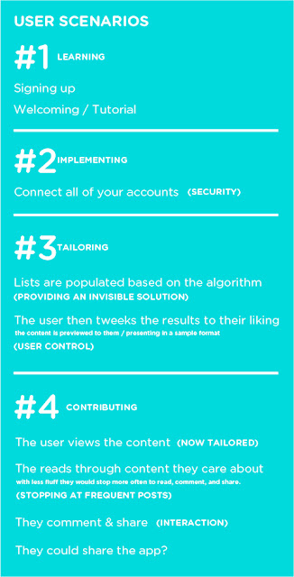
Updated User Scenarios:
Wireframed Scenarios:
(This was done using the Paper App and my iPad. I have sense ordered a stylus to prototype much faster!)
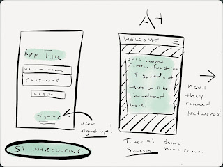
(Scenario 1) Introducing
- Introducing the Application / On boarding - Welcome/Tutorial Screens.
- Signing up / Logging into the App.
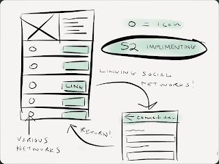
(Scenario 2) Implementing
- Connecting your networks / Looking over your profile.
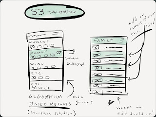
(Scenario 3) Tailoring
- Tailoring / Editing your algorithm established connections. User control.
- For example the app has collected the networks of all of your individual family members.
- They can then select only the members of their family they want to closely follow.
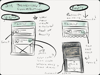
(Scenario 4) Benefiting / Contributing
- Viewing the content of those now tailored master feed of "All" of their connections (or just a category like "Family", or "Favorites".
- Experimenting with the different ways content in the feed can be denoted as what source its from: ie. Facebook, Twitter, Tumblr, Linkedin, etc. I'm planning on small icons currently.
- Replying to that content in a quick, and familiar way. Experimenting with popovers, and as shown below slide to reveal menus in a horizontal and vertical way.
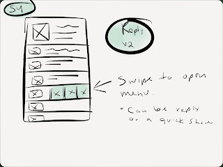
Reply V.2
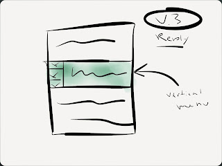
Reply V.2
App Studies of Brewster, and Supply. Both utilize a series of unique but sensible hidden or collapsable menu features. Something I've been struggling with integrating into my own designs.
Svpply is a great source of inspiration regarding its flat design style, subtle use of color and clear settings and roll over navigation interface.
 Brewster is a tailorable contact app which hits close to home regarding my app concept but fails to deliver content outside of contact information and links. Its ability to manage contacts and supply data from existing networks was fascinating and I believe that I see where I can improve on its concept with my own.
February 18, 2013
Degree Project - Week 4
Inspiration (social media app on boarding / built in user app introductory tutorials):
New Survey (To help map my scenarios/behaviors):
Dropmark
Questions for myself moving forward:
- Should I also focus on those not as frequently social media users? This is a tool really for those people who have multiple networks like myself. I think the "Spark" category might be it.
- What are the psychological effects of social media. ie confidence building with "likes"?
- How is my app going to effect that? Can it be plugged into the equation?
- If this app is for the "Spark" kind of user it must allow for gathering of social media statistics for that confidence building moment.
- How can my app foster "trust" and "Control" - See below.
Narrowing the scope:
Focus on spark users. They are the average age of my sample (24), have an average of 1,000 connections to manage, belong to more networks, and is constantly online through their iPhone, iPad, or MacBook Pro. They contribute some of their self-confidence to social media accolades.
Additional Research: (Primarily for reference and research contribution)
Two things social media users demand: (Control & Trust)
Something my app focuses primarily on providing.
Reference: Aimia-Social-Media-White-Paper-6-types-of-social-media-users
Control: "Consumer desire for control over their personal information correlates to the amount of information they’re willing to share, the number of connections they make, the brands with which they engage and the reputation they build online. Control equals exposure: The more control a consumer perceives over their social media activity, the more likely they are to engage with a wider variety of social media networks."
Trust: Social media activity is driven by the level of trust consumers have in their ability to navigate social media, how much they trust their friends and networks with their personal information, and how much trust they
place in the social networks themselves. The degree of trust correlates with consumers’ willingness to share information about themselves through social media. Trust equals participation: The more trust a consumer places in social media networks and their connections, the more likely they are to actively participate."
Fantastic presentation about social media and where its heading:
comScore - It's a social world: Top 10 need-to-knows about social networking and where it's headed from Bianca van de Ketterij
Research regarding my sample age and choice of a mobile focus:
(Researched) User Personas:
Typical Onlooker (16%)
Age: 36
Income: $85k
Education: College Degree
Household: Married, 2 Children
Connections: <100
Networks: Facebook, Youtube, Linkedin, etc.
Tools: PC, Android
Frequency: Daily
Participation: Low
Exposure: High
"I use social media to reconnect with people and typically observe others. I share almost nothing."
Typical Cliquer (6%)
Age: 47
Income: $95k
Education: Graduate Degree
Household: Married, 1 Child
Connections: <100
Networks: Facebook, Youtube, Linkedin, etc.
Tools: iPhone, PC
Frequency: Daily
Participation: Medium
Exposure: High
"I use facebook to post about my day. I like pictures, and I love to comment on my friends' pictures and videos."
Mix-n-Mingles (19%)
Age: 29
Income: $95k
Education: Graduate Degree
Household: Married, 1 Child
Connections: <200
Networks: Facebook, Twitter, Linkedin.
Tools: Mac, iPhone
Frequency: Multiple times a day.
Participation: High
Exposure: High
"I use social media to interact with family and friends–including new friends i've met online."
Typical Spark (3%)
Age: 24
Income: $80k
Education: In grad school.
Household: Lives with partner.
Connections: <1,000
Networks: Facebook, Twitter, Linkedin, Blogs
Tools: iPhone, iPad, Macbook.
Frequency: Always online.
Participation: High
Exposure: High
"Social media enables me to meet with my regular friends and meet new ones. It increased my confidence and allows me to enjoy my life."
February 17, 2013
KCAI Wayfinding - Week 3
Please see Ashley's blog for the most recent blog update!
This week we did a lot of refining within our signs and placements. We started to think about where the signs would be located, what the sides look like, the dimensions, what they might look like at night, etc.
We began taking context shots and decided to lead the viewer from the street outside of KCAI (beginning with the street signs) and working their way into the building. Each photo hints at the photo/sign that follows.
At night, we imagine the text being lit up as well as the transparent triangles, making he signs still easily viewable from a distance in the dark. In the side view, you'll see that the front and back planes exist as separate pieces when coming from the base, but are connected with a thin piece of metal when higher up (as if it were floating).
We've also began laying out the final book and sequencing how it will be read through. The aesthetic of the book alludes to the angles/triangles in our way finding experience and has a clean, architectural feel.
New Street Sign Design:
Height Comparison:
Sign Dimensions:
Updated Map Design:
Night View:
Example Placement:
Book Spreads:
Subscribe to:
Comments (Atom)


.JPG)
.JPG)


