
How I Picked My Theme and Title
The title of my book is "Necessity in Nature" I derived my title from my original mind map composition. My subject "Nature" gave me "Life and death in nature" or "Life Cycle which once narrowed down gave me "Predator-Prey"
Nature > Life Cycle > Predator-Prey
Materials
My covers consisted of sheets of 6x12 birch plywood that I cut down to 6x9.
My backgrounds were all hand painted using Winsor Red Designers Gouache. I primarily used a wash effect to varying degrees depending on the page subject. For example a word like "Starvation" would use a very thin almost non-existant wash to give it a starvation or thinned out effect.
My found imagery I collected from half-price book's by raiding their National Geographic section. Many, many magazines were harmed in the creation of this book.
Statement
In my pages I have used my dot compositions to communicate my theme of Predator-Prey by realizing the idea of the hunter and the hunted in my dots physical characteristics and relative locations. Using the twelve principals of design I was able to effectively do this. For example using my first page Necessity the center dot has had parts removed and likewise to the dots touching the center to symbolize combat in nature and that death and survival is a necessity and form a union in nature.
My material selections I made based on the a source of images I was familiar with and knew I could find a wide array of different animal relationships and ecosystems. It would become boring and repetitive if I used the same kind of animals and settings. So thought out my book I have used woodlands, the sea, and the desert. My cover materials I chose because they directly related to nature. I wanted a wood or tree like feel to my cover. I toyed with thick hand made paper but it was too messy. By removing the type in my cover I was also able to give the illusion of a wound or damage has been done to my book a direct reference in relation to my theme. I think seeing it people would grasp the concept before opening the book.
The book itself flows from necessity which is the main focus of my book into competition. The page after that is terror which I lined up accordingly to show the next page through to help show the relationship between the two. In competition there is terror for the loser. In most cases death. Advantage comes next because the survivor of the prior conflict would have to be at an advantage of some sort to survive. The next page symbiosis related directly to the circle of life of which all nature is part of. his composition was created to show that relationship be it predator or prey. Now starting with consumption my theme starts directly heading into the grave. Consumption shows that there is a predator-prey relationship and someone will be eaten for another to survive. Mortal next shows that spiral to death. The visual elements show that there is no longer a whole. Starvation next is another case in the wild that could cause death. The type thins out as it continues much like an animal succumbing to starvation. Extinction is the final form of my book. The end all to end all. Like the backgrounds in starvation and extinction even the paint is spread thin.
Next time around I would better perfect my craft and my preparation for the use of other materials I might need to use from hard to reach sources. I would also further expand my concepts.
Pages

This cover will be lazer cut out.
Look for it finalized at our sophomore review or on my blog later
The image is just a place holder showing what would be reveled on the other side of my cover if it was removed. Ideally on the back of this birch cover sheet there would be another of my painted background compositions glued to it so that just red showed through.
My cover uses Alignment, and Positive and Negative Space.

Another view of how it would show through.

Page #1 - Necessity
Necessity is using Asymmetry, Scale, Compound Shape, Layers, and Correspondence.

Page #2 - Competition
There is a cut out in the center of this composition that shows through to the page below "Terror" to strengthen my "competition"composition.
Competition is using Symmetry, Scale, Compound Shape, Layers, Correspondence, Positive and Negative Space, and Proximity.
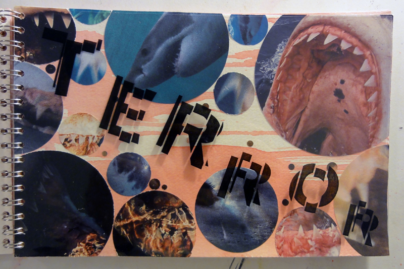
Page #3 - Terror
Competition is using Asymmetry, Scale, Compound Shape, Layers, Correspondence, Continuation, Repetition, Framing, and Proximity.

Page #4 - Advantage
Advantage is "taking advantage of" Competition is using Symmetry, Scale, and Correspondence.

Page #5 - Symbiosis
Symbiosis is using Asymmetry, Scale, Compound Shape, Layers, Correspondence, and Proximity.

Page #6 - Consumption
Consumption is using Asymmetry, Scale, Compound Shape, Layers, Correspondence, and Positive and Negative Space.

Page #7 - Mortal
Mortal is using Asymmetry, Scale, Correspondence, Framing, and Proximity.

Page #8 - Starvation
Starvation is using Asymmetry, Correspondence, and Proximity.

Page #9 - Extinction
This one is a hard one to see on here. The image is inside the "o".
Extinction is using Scale, Framing, and Asymmetry.

No comments:
Post a Comment