April 27, 2011

iPad - Modern Geek Round #3 Revisions / Magazine Cover Edit


Page #1 (ACTION: Swipe)

This time around I have revised my spreads down to two columns and raised my type to Garamond 11/13 to increase legibility. 

The beginning blurb diamond shape has been scooted over to rest on top of the first column better, This was also increased in size for better legibility. 

ACTION: Menu Bar (on touch)

ACTION: Menu Bar all the way out. 

ACTION: The infograph is interactive. You can touch any of the dots in the chart to pull up a video about the most popular videogame from that particular console. 

ACTION: Video in action. 


Updated magazine cover. 


Six Degrees Of Separation - Process Shot Round #1 & 2 + Concept

The Most Recent Round Of Images.
Shot to the specifications of the ones Jessi and I chose from our test shoot in studio. 


VISUAL REFERENCES:

The use of six steps to reference the six degrees.
Set the world on fire title.
Delicate balance: The ecosystem referenced by the balance of the globe resting on the edge of the gas can.

TYPE REFERENCE:

Replace the text on the gas can with our title.


POSTER:
Match alone falling towards the globe.
* Note from Tyler to make sure this stands out as different but still relatable to the cover of the DVD.


FRONT COVER:


Good looking healthy earth.
Globe with Gas Tank.
Match could be suspended with fishing line?
Older worn out globe.

Background: Stone: Dirty concrete. (Light & Dark depending on lighting conditions)

Background: Crushed rocks and debris.
Background: Sand and soil. 
Background: Dead Flora& Fauna (Possible but not probable)


BACK COVER:

Gas can turned on its side.
This replaced the old idea of showing a gas pump.
Maybe in a puddle?
No puddle just a single drip of water hanging there?


INSIDE THE CASE (TRAY SIDE):
* When you pick up the earth image / disc you'll revel this.
Charred flaming husk of earth.
Image underneath the disc.

INSIDE THE CASE (DISC):
Earth on fire and in distress.
Flames go above the disc edge and match up with the charred husk tray image.

INSIDE THE CASE (INFO): 

General information.

DVD MENU:
Earth in the background with video loop background of the match falling down on top of the earth and setting itself on fire. 

Process Shots Round #1 In Studio:


This is a group process post between Jessi & I. 


April 25, 2011

Smithsonian Exhibit / iPhone App Skins & Features + Visual Identity Update

Navigation Context:
 Home Icon, Application Menu (Horizontal & Vertical), and Subcategory Menu. 


Smithsonian Website Banner + Banners in context infront of the Smithsonian. 

Gift Bag + T-shirts

iPhone Application + Banners out of context

iPad - Modern Geek First Translation (2 Variants)

Version #1 / Page #1

Some moments and features that my iPad Magazine App will be using are:

A Hidden / Touch To Bring Up Navigation Bar that runs along the top and bottom of the iPad. 

  • The Top Nav Bar: will consist of an option to [Save] the article to an account / list. Next there will be a [Share] button allowing the ever important social median integration for sharing the article across mainstream social networking sites as well as the growing aggregate news sites such as reddit or digg. After there I will have the ever needed [Home] Button.
  • The Bottom Nav Bar: This bar will display a series of thumbnails of the following pages in the article. After thinking about it further I would want the current page to be centered in the middle of the thumbnail bar possibly highlighted reinforcing the ability to skip back a few pages if need be without having to swipe back several times. 

Touch To Change Page Button: Hidden on the left and right side of the screen for easy page switching. This could replace swiping if so desired. 

Touch To Expand Image: For example you want to look closer or to explore one of my infographics you could touch once to expand the size to full screen or finger pull with two fingers to simple zoom in slightly. When you release it would shrink back to normal size to avoid screen space conflicts and user confusion or panic. 


This version is the closest in relation to the actual magazine. For this reason I will be moving forward with this particular design to keep an overall well rounded project to present. 

Page #2

Page #3
This version shows the touch to expand infograph image. 

Page #3 Variant
This version shows the idea of the start and fully opened infographic. 

Set #2
Page #1
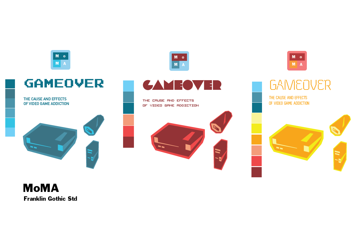
Blue theme, with new typefaces, accents, and pinch action. 

Page #2

Page #3
Pinch to zoom is displayed in this version using the two circle marks and arrows. 

Geek Culture Magazine Spreads Process Update W/Cover

First Trial Cover

I will be adjusting primarily the kerning in this cover. 

The spreads below I adjusted my rag for the 6th time. I now have a huge amount of respect for people who can't get a clean rag and make it look easy. 


Spread #1

Spread #2

Spread #3

I left the old format I had created behind this time around and simply stuck with the single diamond shape. This is instead of using multiple diamonds to dictate the page number. I changed the font that the number used from Future Light Condensed to Medium Condensed for legibility. I will be working on visually correcting the baseline alignment this next run. 

I finally gave in and shifted the diamond shape into the center to fit my opening blurb into it. Its working a lot better, but I had to try everything first to give in to the simple answer. 

April 22, 2011

Smithsonian Exhibit / iPhone App Skins & Features + Visual Identity

Application Features:

  • Gift Shop Integration - Purchase before your visit or during your visit to the Smithsonian through the Game Over Exhibit Application and shop without worrying about or lugging around your purchases until your ready to leave.
  • Google Goggles Integration - Simply tap the Google Goggles glasses icon to open up a camera sub-program that when pointed at any display in the exhibit will pull up additional factual data for your enjoyment.
  • Social Networking Integration - Tap the Share button to seamlessly post to your Facebook Wall, Tweet, or send an E-mail to share your experience with others with a simple popup verification and menu screen. After message has ben sent the screen will automatically close. 
After crit today this is the set that I will be moving forward with. I will be making a third iPhone screen to display the subcategories within my app. Along with this subcategory I will implement the use of Google Goggles to display information about the attractions within the museum using your smart phone. You simply open the application with the tap of a button and the application scans the display simply by opening the app.

I have included a video of Google Googles in action below.
Set #2

Set #2
Set #3

Set #3

Google Googles Implementation Example. 

Style Guide For Each Set

April 20, 2011

Modern Geek Magazine Spreads - iPad Wireframes

Let me just start by saying I am really excited to be working with iPads and Apps. This is something I am definitely looking into in more in the future as a possible field of specialization. Some moments and features that my iPad Magazine App will be using are:

A Hidden / Touch To Bring Up Navigation Bar that runs along the top and bottom of the iPad. 

  • The Top Nav Bar: will consist of an option to [Save] the article to an account / list. Next there will be a [Share] button allowing the ever important social median integration for sharing the article across mainstream social networking sites as well as the growing aggregate news sites such as reddit or digg. After there I will have the ever needed [Home] Button.
  • The Bottom Nav Bar: This bar will display a series of thumbnails of the following pages in the article. After thinking about it further I would want the current page to be centered in the middle of the thumbnail bar possibly highlighted reinforcing the ability to skip back a few pages if need be without having to swipe back several times. 


Touch To Change Page Button: Hidden on the left and right side of the screen for easy page switching. This could replace swiping if so desired. 

Touch To Expand Image: For example you want to look closer or to explore one of my infographics you could touch once to expand the size to full screen or finger pull with two fingers to simple zoom in slightly. When you release it would shrink back to normal size to avoid screen space conflicts and user confusion or panic. 


Page #1

Page #2

Page #3

Museum Exhibit Concepts


Six Degrees Group Concept Mind Map

Group mind map with the first round of concepts that Jessi and I pitched to Tyler. 
Project is looking exciting! And possibly illegal... Stay tuned :)

Geek Culture Magazine Spreads Process Update

I'm currently in the process of a final round of edits to my magazine spreads before they hit the iPad tomorrow as. 

Please pardon the quality of the images. My camera charger is missing >_< so I had to use my iPhone. 

First Round of Cover Iterations

Five Rounds of Cover Iterations


Three Rounds of Second & Third Page Spreads

Three Rounds of Forth & Fifth Page Spreads


Leading Exercises.