
Reading about how the industry and graphic design firms are having to bow to public pressure reguarding the wishes of the consumer is extremely fascinating. It shows that the power that comes from the choice of the consumer is still king. Hopefully this will hold back the trends of designing a product that is force fed back to the populous without little more than a limited focus group. As designers we want the consumer to not only need to buy the product but you want them to feel passionate about buying that particular product. The Tropicana brand symbol for example with the straw going through the orange. They didn't even realize how passionately their consumer base felt about the established icon. I don't think even the consumers realized how much they cared about purchasing Tropicana until it was changed. Mr. Campbell seeing this passion for their product even though it was because of a negative change understood that if they reverted back to the original icon those consumers would be happy. Each one of those consumers who complained about the change to Tropicana will now feel that they had a hand in bringing back the old logo. Do you think they might purchase another brand after all of that? I think not. Not only that but the hype around the change drummed up countless amounts of free marketing. The very fact that we're discussing it in Visual Language says something about it. I'm going to the grocery store tonight... guess what I might just have to purchase now? Thats right. Tropicana Orange Juice.
The other half of this article that touched on social media's influence on consumer products. I am extremely fascinated by social media, its applications, and its power in this era. Its refreshing to see that by using Twitter, and Facebook the consumers have a voice that will allow those companies and the design / advertising firms they hire to produce better work based on that feedback. If anything we should see advertising become increasingly effective across all mediums.
September 30, 2011
Union Station 1940's Timeline Notes
UNION STATION TIMELINE
Narratives: Wartime & The Long Decline
Audience: Families and students that visit Union Station.
* Music from the 1940’s
WARTIME:
Union Station Information from main website:
1945: Passenger traffic hits a record 678,363 travelers w/ a significant numbers of armed forces personal passing through Union Station on their way home from WW II.
1940?: The era of R.A. Long. Lumber Baron, developer, investor, newspaper owner, millionaire, philanthropist, ends.
Union Station has a collection of significant items that represents the history of Kansas City.
Union Station Kansas City Book:
Gasoline and rubber rationing made trains more popular. pg. 140
The numbers of tickets sold: 365,780 to 1,169,995. pg. 140
Train passenger volume swelled in 1940 from 59,474 to 72,302 at the wars end. pg. 140
Any trains that were less than 40% full were shut down by the Office of Defence Transportation. pg. 140
Waiting room resembled an army camp.
The loud speaker comes on and announces that we were attacked at Pearl Harbor and the United States have declared war on Japan and Germany. An African American women started singing “God Bless America The Land That I Love”. There are two different sources that this fable comes from. Two different women that it could have been. Marian Anderson and Pearl Bailey. Neither of them mention it in their autobiography. The Union Station didn’t have loud speakers at the time and thus debunks the myth. Either fact or fiction it embodied the spirit of the American passengers and the tension between the situation at hand. pg. 140
The marriage factory - A temporary mating ritual. In the crowd at the gates a man and a women traveling alone locked eyes. The soldier knew the women’s predicament: Little chance of getting on board. Without a word spoken, he motions the women over and gets her through the military check point with him. He flirted with her but then they went their separate ways.
Travelers aid society. 1,000 requests a day. For money they could use for food and directions.
Upstairs at the ticket counters women were given jobs for the first time. People would try to take advantage of them.
Right after the war ended business took a holiday across the city and the Fred Harvey restaurant at union station had 60 - 100 people in line constantly.
When the war was declared over people rejoiced while they were waiting.
MISC.
People were being torn apart from one another. A very emotional sight to see.
They handled airplane motors, and 2,000 lbs bombs. Other than that they were not outfitted for military production or support. pg. 148
It wasn’t very patriotically embellished. People were so busy with travelling they didn’t really have time for patriotic embellishments. pg. 148
the 1940’s was the busiest Union Station ever was.
Mail was the largest cargo business at the time. pg. 148
Christmas day in 1943 seven dozen boxcars stuffed with holiday greeting sat on the sidings around the station’s grounds. Waiting to be unloaded. Not enough man power was to be found to help unload everything in time. pg. 149.
It was connected to a post office. See above.
They sorted 2,000,000 feet of catalogs and letters in one week. During the Christmas season it was just worse.
1945 - News came over the loud speakers that the war had ended. pg. 150.
TESTIMONIALS:
Bill Lawrence
Sally Martin Rice
David Pence
Walter Lewis
Edna Sutton
Isak Federman
THE LONG DECLINE:
“Heady years after World War II masked the oncoming decrease in rail passenger travel.” pg. 160
Week before Christmas 1947: Charles Clancy had been there since the beginning, first as a train caller, then as an assistant stationmaster, and now as a stationmaster. He had been there since the first days when every Kansas city citizen rushed to see the new industrial palace. He had been there in the late ‘20s, too, when the palace was packed with and he had wrestled a steer to the marble floor. He had been there during the depression, when the crowds dwindled, and during the second world war, when they re-emerged. And now again post holiday seemed to signal a return to peacetime prominence. pg. 158
1947: Shoppers waited in line inside Harvey stores to order Christmas gifts. Yes, the station was humming, back to normal, back to the way it used to be. That old adage that you couldn’t go back to union station without seeing someone you knew held true. Sure, train traffic had dipped from the war years but who didn’t expect that? War rationing had ended, troop movements slowed to a trickle, and car sales had bounced back after being all but nil during the war years. Yet people were still riding the rails. Better yet, they were riding more than during the depression, more at least at Union Station than any year since 1930. pg. 158
The passenger train business was shriveling up. The postwar slowdown that was inevitable after trains’ wartime dominance turned out to be the start of a precipitous decline. The number of passengers nationally dropped 13 straight years, to about one-third of the wartime peak. During this period, too the city of Kansas City suffered its own slide, plunging from the ranks of Americas’ top 20 metropolises as its urban neighborhoods hollowed out. pg. 161
These were obvious signs for Kansas City’s beloved train depot. For, if there was one constant in its life, it was this as go the railroads and the city so goes Union Station. pg. 161
Santa Fe launched a new stream liner out of Kansas City, the Kansas City Chief, with overnight service between Union Station and Chicago . The Kansas City Southern, too, re-equipped its southern belle and cut the running time to New Orleans by 14%. pg. 161
These bright spots, however, became momentary blips in an otherwise bleak business. From the wartime peak of nearly 1 billion passengers, the number of train travelers nation-wide fell below 800 million in 1946. bellow 600 million in 1949, and bellow 400 million in 1957
Tickets Sold & Trains Handled:

The arrived in 1949 to study the Fred Harvey operations. Restaurant revenue was down one-third since the war. Sessions reported, and the eateries no longer turned a profit. pg. 166
“Failure to modernize will be accompanied by the risk of gradual deterioration of the remarkably high prestige which Fred Harvey enjoy in Kansas City.” - 1949 study by consultants. pg. 166
QUESTIONS TO ASK:
Who was R.A. Long? What was his impact on the Union Station in 1940.
Did they transport any other materials other than soldiers.
Do they have a passenger manifest or log? A documentation of passengers transported, tickets sold, trains used, etc.
Were there ever fights for seats on the train?
Who created Union Station? Who designed it? Who’s idea was it?
Where there any buildings created to aid in transportation during the 40’s?
How long have the collection series been around?
Any relations to Corinthian Hall?
What year did Fred Harvey restaurant open?
Did some mail just get trashed due to backup?
NOTES FROM LECTURE:
The biggest time for union station.
One of two of every soldier that was leaving the us passed through Union Station.
Period of the most trains.
Period of the most passengers.
Harvey dining house was open on VJ day when most others weren't.
Union Station became a facility to support the war effort.
People would come to the Union Station to see the news reels about the war before movies.
Early 40’s the starts would come from the east coast to the west coast and would stop in Kansas City.
The 40’s was an era of sadness with families being torn apart so the men could go off to war.
Narratives: Wartime & The Long Decline
Audience: Families and students that visit Union Station.
* Music from the 1940’s
WARTIME:
Union Station Information from main website:
1945: Passenger traffic hits a record 678,363 travelers w/ a significant numbers of armed forces personal passing through Union Station on their way home from WW II.
1940?: The era of R.A. Long. Lumber Baron, developer, investor, newspaper owner, millionaire, philanthropist, ends.
Union Station has a collection of significant items that represents the history of Kansas City.
Union Station Kansas City Book:
Gasoline and rubber rationing made trains more popular. pg. 140
The numbers of tickets sold: 365,780 to 1,169,995. pg. 140
Train passenger volume swelled in 1940 from 59,474 to 72,302 at the wars end. pg. 140
Any trains that were less than 40% full were shut down by the Office of Defence Transportation. pg. 140
Waiting room resembled an army camp.
The loud speaker comes on and announces that we were attacked at Pearl Harbor and the United States have declared war on Japan and Germany. An African American women started singing “God Bless America The Land That I Love”. There are two different sources that this fable comes from. Two different women that it could have been. Marian Anderson and Pearl Bailey. Neither of them mention it in their autobiography. The Union Station didn’t have loud speakers at the time and thus debunks the myth. Either fact or fiction it embodied the spirit of the American passengers and the tension between the situation at hand. pg. 140
The marriage factory - A temporary mating ritual. In the crowd at the gates a man and a women traveling alone locked eyes. The soldier knew the women’s predicament: Little chance of getting on board. Without a word spoken, he motions the women over and gets her through the military check point with him. He flirted with her but then they went their separate ways.
Travelers aid society. 1,000 requests a day. For money they could use for food and directions.
Upstairs at the ticket counters women were given jobs for the first time. People would try to take advantage of them.
Right after the war ended business took a holiday across the city and the Fred Harvey restaurant at union station had 60 - 100 people in line constantly.
When the war was declared over people rejoiced while they were waiting.
MISC.
People were being torn apart from one another. A very emotional sight to see.
They handled airplane motors, and 2,000 lbs bombs. Other than that they were not outfitted for military production or support. pg. 148
It wasn’t very patriotically embellished. People were so busy with travelling they didn’t really have time for patriotic embellishments. pg. 148
the 1940’s was the busiest Union Station ever was.
Mail was the largest cargo business at the time. pg. 148
Christmas day in 1943 seven dozen boxcars stuffed with holiday greeting sat on the sidings around the station’s grounds. Waiting to be unloaded. Not enough man power was to be found to help unload everything in time. pg. 149.
It was connected to a post office. See above.
They sorted 2,000,000 feet of catalogs and letters in one week. During the Christmas season it was just worse.
1945 - News came over the loud speakers that the war had ended. pg. 150.
TESTIMONIALS:
Bill Lawrence
Sally Martin Rice
David Pence
Walter Lewis
Edna Sutton
Isak Federman
THE LONG DECLINE:
“Heady years after World War II masked the oncoming decrease in rail passenger travel.” pg. 160
Week before Christmas 1947: Charles Clancy had been there since the beginning, first as a train caller, then as an assistant stationmaster, and now as a stationmaster. He had been there since the first days when every Kansas city citizen rushed to see the new industrial palace. He had been there in the late ‘20s, too, when the palace was packed with and he had wrestled a steer to the marble floor. He had been there during the depression, when the crowds dwindled, and during the second world war, when they re-emerged. And now again post holiday seemed to signal a return to peacetime prominence. pg. 158
1947: Shoppers waited in line inside Harvey stores to order Christmas gifts. Yes, the station was humming, back to normal, back to the way it used to be. That old adage that you couldn’t go back to union station without seeing someone you knew held true. Sure, train traffic had dipped from the war years but who didn’t expect that? War rationing had ended, troop movements slowed to a trickle, and car sales had bounced back after being all but nil during the war years. Yet people were still riding the rails. Better yet, they were riding more than during the depression, more at least at Union Station than any year since 1930. pg. 158
The passenger train business was shriveling up. The postwar slowdown that was inevitable after trains’ wartime dominance turned out to be the start of a precipitous decline. The number of passengers nationally dropped 13 straight years, to about one-third of the wartime peak. During this period, too the city of Kansas City suffered its own slide, plunging from the ranks of Americas’ top 20 metropolises as its urban neighborhoods hollowed out. pg. 161
These were obvious signs for Kansas City’s beloved train depot. For, if there was one constant in its life, it was this as go the railroads and the city so goes Union Station. pg. 161
Santa Fe launched a new stream liner out of Kansas City, the Kansas City Chief, with overnight service between Union Station and Chicago . The Kansas City Southern, too, re-equipped its southern belle and cut the running time to New Orleans by 14%. pg. 161
These bright spots, however, became momentary blips in an otherwise bleak business. From the wartime peak of nearly 1 billion passengers, the number of train travelers nation-wide fell below 800 million in 1946. bellow 600 million in 1949, and bellow 400 million in 1957
Tickets Sold & Trains Handled:
The arrived in 1949 to study the Fred Harvey operations. Restaurant revenue was down one-third since the war. Sessions reported, and the eateries no longer turned a profit. pg. 166
“Failure to modernize will be accompanied by the risk of gradual deterioration of the remarkably high prestige which Fred Harvey enjoy in Kansas City.” - 1949 study by consultants. pg. 166
QUESTIONS TO ASK:
Who was R.A. Long? What was his impact on the Union Station in 1940.
Did they transport any other materials other than soldiers.
Do they have a passenger manifest or log? A documentation of passengers transported, tickets sold, trains used, etc.
Were there ever fights for seats on the train?
Who created Union Station? Who designed it? Who’s idea was it?
Where there any buildings created to aid in transportation during the 40’s?
How long have the collection series been around?
Any relations to Corinthian Hall?
What year did Fred Harvey restaurant open?
Did some mail just get trashed due to backup?
NOTES FROM LECTURE:
The biggest time for union station.
One of two of every soldier that was leaving the us passed through Union Station.
Period of the most trains.
Period of the most passengers.
Harvey dining house was open on VJ day when most others weren't.
Union Station became a facility to support the war effort.
People would come to the Union Station to see the news reels about the war before movies.
Early 40’s the starts would come from the east coast to the west coast and would stop in Kansas City.
The 40’s was an era of sadness with families being torn apart so the men could go off to war.
September 28, 2011

Modes of Appeal Updated Item List
Pathos (NEW):
IN THE PROCESS OF BEING REPLACED
Target: ?
Ethos:

Neutrogena - Transparent Facial Bar
Target: Adults who want to maintain healthy skin or improve the current state of their skin.
Logos

Band-Aid - Plastic Strips
Target: Adults in need of a quality adhesive bandage.
Modes of Appeal
Pathos: (*REPLACED)
Little Colds Multi-Symptom Cold Formula
Target: Parents of young children.
Ethos:
Neutrogena - Transparent Facial Bar
Target: Adults who want to maintain healthy skin or improve the current state of their skin.
Logos: (*Removed)
Shaklee - Vita-Lea Vitamins
Target: Health conscious adults who take a daily multi-vitamin.
Ethos / Pathos: (*Now Logos)
Band-Aid - Plastic Strips
Target: Adults in need of a quality adhesive bandage.
Questions bellow asked to a customer.

What made you pick that package over another?
I picked this one because its colorful, and relates to how I've been feeling (they had a cold). Also its cute!
What part of the design speaks to you first?
The chalkboard look of the letters, hearts, and contrast.
What is the first thing the consumer does after picking up the package?
They flipped it over and read the back of the package.
How is the package handled?
They turned it on its side and back side to read more of the information.
How did the package look among other products around it?
It has a narrative with the little kid on the front, the typography, and the hearts gives it a humanistic quality and feel to it.
How does it interact on the shelf space?
The side declaration statements are enticing and the check marks help enforce it. It interacts well with products of the same type. They create a nice visual rhythm. We're used to seeing things in patterns. No tag or prop.
5 Second test
Little kid with chalk text.
Multi-symptom cold med for children 4+
Can't remember the name of the brand
The little boy had a brown hat on and the kid was also on the top of the package.


September 24, 2011
Final Folly Theater Poster for John Pizzarelli

I designed my poster for the Folly Theater Jazz Series featuring the musician John Pizzarelli and his Quartet. Pizzareli is a modern day Sinatra with heavy influences from Nat King Cole, Frank Sinatra, and Bucky Pizzarelli his father. Pizzarelli is also known for his revitalization of the great american song book. Bringing many classic american jazz songs back into prominence along with a new contemporary audience. He is known for his guitar playing and vocals equally. His voice and signature guitar sound are what truly makes him John Pizzarelli. For that reason I have chosen to represent him with a metaphor of a classic microphone from the era of his inspiration and father with an exact copy of his seven string signed guitar that he plays with at every show. The rendering style that I chose to hand drawn the composition in is contemporary and I believe it will help draw the attention of the youthful crowd of next generation of jazz lovers. The blue background complimenting the orange guitar I believe will really help the two objects pop out in the composition catching the eye of viewers as far away as in their cars driving past the Folly Theater.

Billboard supplemental.
September 23, 2011
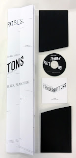
Tender Buttons Final
Objects in Space. An Anthology of Poems by Gertrude Stein.
I chose to name my anthology "Objects in Space" because every poem that I selected is from the Objects collection. These individual poems or "objects" float in the folds of the composition. Each one ideally could be arranged endlessly in a plaine that has only rules to break. The sections of text have been broken up, and re-assembled over top an axis of folds. This allows for a fluctuation in the sense of depth and the creation of several viewpoints of which the viewer can explore all parts of the composition as a whole in the cubist spirit. I chose to represent Stein's works using a visual method that could be manipulated physically by the shuffling of pages allowing the viewer to change the meaning of the message in each line. This is part of the cubist spirit that encompasses my concept. I wanted the viewer to feel that they had total control of not what Stein was saying but what they were saying at the not only as the viewer but as a fellow creator. I would like to image that had Picasso and Stein sat down together with a jumble of letters and canvas they would have composed something like this.
* Moments Book not displayed


September 19, 2011
Tender Buttons Animation
First video I uploaded was short for some reason so I have since re uploaded a new version that uses the correct time limit.
September 16, 2011
Tender Buttons Animation Adjustments
After last class critique I am experimenting with some adjustments to my video.
Some changes I am experimenting with:
Some changes I am experimenting with:
- Adjusting the speed at which my type revels its self from behind the mask.
- Trying other axis locations and directions.
- Adjusting typographic hierarchy to match the book better.
- Variation of wiggle speeds.
- Experimenting with the order in which my type fades from the screen.
- Trying a rotating title for each poem to reference my double sided book foldout.
September 13, 2011
Folly Poster Series Directional Update

Moving Forward:
5 version with distinct color variations.
Quick color tests.
Main Focus:
Hand drawn imagery and typography.
Typography based on futura bold and simular typefaces with a solid distance clarity.
Add more too it.
Play with color more.
Objects:
Simplified shapes and more of an abstract build.
Color Pallets:
Strong contrast and color values are needed.
Experiment with quick color tests.
- Literal
- Fun
- More Hip and Fresh
- Sinatra
September 12, 2011
Folly Theater Poster Check List
Have you connected with the audience?
What makes it memorable?
Yes. His fans know his style and what he's known for. I just need to work on refining these styles to appeal to both age groups.
Is the message clear?
Some what. Using the imagery it applies to the audience in question. This still needs a fair amount of work though.
Some what. Using the imagery it applies to the audience in question. This still needs a fair amount of work though.
Is it visible from a distance?
The large forms of the guitar and the mic stand out well against the background and are visible at a distance. I believe that some of the detail could be lost far enough away and should be simplified to enforce clarity especially for car distance.
What is the visual entry point?
In the guitar forms the visual entry point is the fret board. If the image is pulled out enough some of the detail and ornamental imagery calls your attention first. In the microphones the the shape of the overall microphone calls your attention first. Once the microphone has been realized the city is noticed.
What is the second element you want to see?
Typically it would be the city shape, or the smaller guitar form.
Typically it would be the city shape, or the smaller guitar form.
Do the visual codes connect to and represent the subject?
The jazz guitar and older Sinatra age microphones.
The jazz guitar and older Sinatra age microphones.
Are there any emotional cues?
No.
No.
What makes it memorable?
The style and juxtaposition of well known representational objects.
Are there any distractions?
Are there any distractions?
No. Unfortunately still too simple.
September 10, 2011
Tender Buttons Animation Update

Title screen reference.
This text fades in and out.
While visible it has a slight shake to it.

Type coming out from behind a mask at varying speeds.
There will not be a traditional order behind this as the lines of text come out you will have the ability to read it in variing order until its completely unhidden.
I will be doing this to represent a sense of growth and typographic evolution.
The text has a slight shake to it that isn't being shown here.

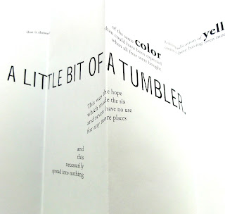
This is an example of the structure of the poem I will be referencing.
Tender Buttons Book Update After Group Critique
Projects Status Currently:
Overall Build: Book folds out into a 22x28 sized double sided poster.
Disc: The cd will be placed into a white sleeve with black text laid on top of it from the poem above it.
Changes:
- After exploring earlier fully fleshed out double sided mockup I realized that I need to reorder the pages.
- I will be adding my concept to the colophon and possibly removing the colophon title from its section as it may distract from the over all composition.
- I will be removing the page numbers on the index as this concept allows for any order of the poems to be perceived and listing them in order would add structure to the way the viewer will read the works.
Possible Changes:
- I will be exploring multiple shorter folds to allow for a easily turned page.
- I am exploring the possibility of using a black shape in the very center of the folded out book as a place to leave my title instead of using one of the "sections" reserved for Steins poems.
"Push the limits"

This is an example of the size increase from 18x24 to 22x28 in the book folded out in poster form. This will allow for larger typography use and help with clarity.

Some different title variations in the works.

Example of how the poems are organized.
John Pizzarelli Folly Theater Poster Sketches - Critique & Moving Forward
These are the three sketches that were chosen during critique that I will be moving forward with:
General Reference Notes:
Try the mic and the guitar together as separate objects in the same frame.
Do not use more than two signs combinations at a time.
For example six possible combinations:
Rendering Methods:
Vector
Vector / Hand Drawn
Photographic Collage


General Reference Notes:
Try the mic and the guitar together as separate objects in the same frame.
Do not use more than two signs combinations at a time.
For example six possible combinations:
- Guitar / Mic
- Guitar / City
- Mic / City
- Mic / Guitar
- City / Guiar
- City / Mic
Rendering Methods:
Vector
Vector / Hand Drawn
Photographic Collage

Adjustments:
Try this concept with a mic instead of a guitar.
I need to show more of the guitar head for clarity.
Now using the NYC skyline I will make the city larger to show emphasis on his roots and sound.
Separate the artists name and date / time information.
Remove the double use of his name.

Adjustments:
One version with the type inside and one with the type outside.
Try to avoid too much negative space or make it work in my favor.
Try allowing the typography to be the fret board.

Adjustments:
Reming as a possible reference for ribbon type placement.

Adjustments:
One version with the type inside and one with the type outside.
Explore type use on the sides with only part of the mic being shown.
I won't be using any tilted image axis anymore to increase clarity.


Subscribe to:
Posts (Atom)
