
October 28, 2010


October 27, 2010
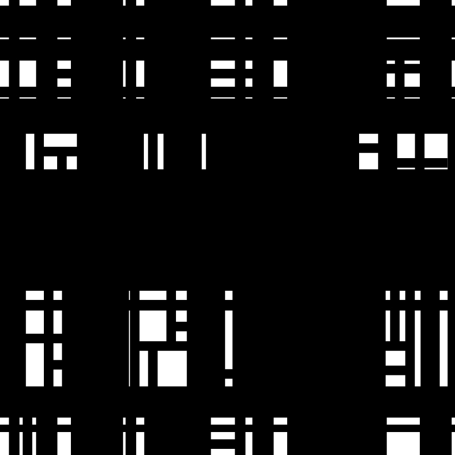
Find + Share - Spreads/Grids by Neal Fletcher about Jan Tschichold w/links
 |
| Example spread "Magazine Article based on our given typographer - (Jan Tschichold) for a fictional typographic magazine; Forefront." |
 | |
|
Contents & Front Cover by the same designer's project
 |
| Contents Page |
 |
| Front Cover |
Jan Tschichold, wrote a book called "Die neue Typographie" or "The New Typography" in which he diagrams what he consitered good and bag magazine spreads. This is interesting to look at because shortly afterwards he abandoned in 1932 claiming it was too extreme. He also went so far as to condemn Modernist design in general as being authoritarian and inherently fascistic.
See also this chart from "Design elements: a graphic style manual" By Timothy Samara

I also suggest looking at:
October 26, 2010
Viscom Project #2 - Line Study Evolution

The West Bottoms
My posters follow a three part narrative about the state of the West Bottoms. "Urban, Decay, Repurposed" Urban because a major contributing factor of urban decay is the freeway systems. Decay, and Repurposed you can see in the other two posters. This is based on the recent growth in the West Bottoms and their recent accusation of several million dollar companies moving into the area and artisan clients setting up shop there.
Statement
I arranged my graphic space as to show the rhythm of the freeway beams in a balanced harmony with the progression of my line study. It draws your eye into the text and then into the photograph. I want the viewer to be drawn into the underpass of the freeway. Let the distance and depth of the image reflect the narrative. The construction, de-industrialized, void like visual identity of the west bottoms (which it is currently coming out of). The freeway beams in the photograph are activating my line study above giving it balance and purpose. I juxtaposed my line studies and my photograph according to the areas in my photography that held space to compliment and continue my line study into. After creating thumbnails I looked for imagery in the West Bottoms that resembled my ideas or stumbled across that naturally help potential for juxtaposition. I employed tools like the Konica, scanner, and projector for manipulation. My Canon XTI, and Sony HX5V to capture my photography and processed and adjusted images in Adobe Photoshop, and Illustrator.

Basic Line Study
Complex

Raw Manipulation

Final Edit

Juxtaposition Final Edit w/ Photo
Early concepts & progression of this poster:

The idea was there but not realized yet

I tried playing off of the pillars instead of the freeway beams

Experimenting

Experimenting

The final version almost realized minus the final adjustments which I will describe bellow.
This final version has been updated to use Futura Medium Condensed to follow the same type faced used in the other two posters. Its hard to see here but there is now a gradient that flows down from the top of the poster in the lines to the freeway beams going from a 90% black into a 10% fade when it reaches the beams. The "S" in Bottoms is now bleeding off the page. The word "Urban" is hidden in the middle left side of the composition using a gradient.
October 25, 2010
Paula Scher: The Geography of Design

October 24, 2010
October 22, 2010
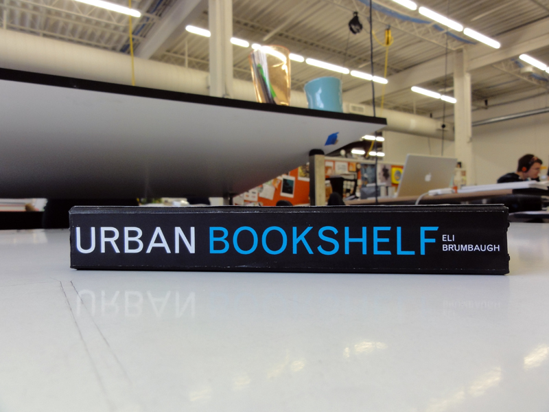
Urban Bookshelf - Book Design & Images
"Urban Bookshelf" - Books in different environments around Kansas City.


Colors of the Social Web
Link to the article
(Thanks to Scott Hansen portfolio / blog iso50.com for pointing this out)
Seriously read his blog. Its a gold mine of inspiration.
Extremely interesting read for those of us interesting in branding and identity.

"When we released our report on the colors of the social web, based on data analyzed by our Twitter theme tool, we were surprised that blue was such a dominant color in people's profile designs. Was Twitter's default color influencing their design decisions? Or is blue really THE most popular and dominant color online? ...We decided to look at the colors in the brands from the top 100 sites in the world to see if we could paint a more colorful picture."
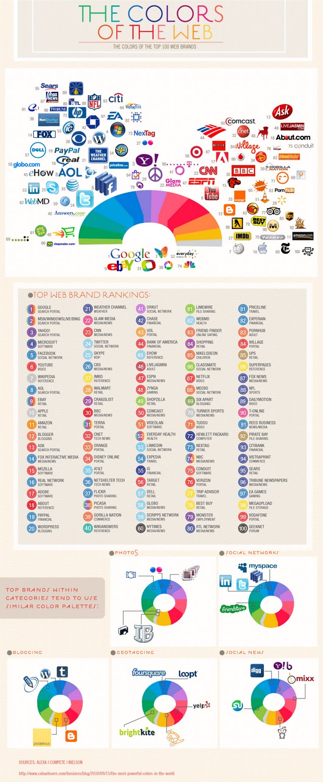
Turns out the blue-berry doesn't fall far from the bush. The web landscape is dominated by a large number of blue brands... but Red occupies a large amount of space as well. What's driving this? You might want to say that carefully organized branding research and market tests were done to choose the perfect colors to make you spend your money, but a lot of the brands that have grown to be global web powerhouses, started as small web startups... and while large corporate giants with branding departments spend quite a lot on market research, user testing, branding, etc. Lots of the sites listed above got started with brands created by the founders themselves with little to no research into the impact their color choice would have. I once asked Mark Zuckerberg, the founder of Facebook why he chose blue for his site design... "I'm color blind, it's the only color I can see." ...and now 500 Million people around the world stare at a mostly blue website for hours each week.
While the initial reasoning for the colors chosen may be trivial, the impact that these dominant players now have in the web world will surely influence the smaller startups that want to share in the positive color associations created by their bigger siblings... Once a rocketship of a web startup takes flight, there are a number of Jr. internet astronauts hoping to emulate their success... and are inspired by their brands. And so Blue and Red will probably continue to dominate, but we can have hope for theGoWalla's, DailyBooth's and other more adventurous brands out there.
October 20, 2010
Vector vs Bitmap

Working with a really modern and clean area like power and light it could really benefit from having the sharp clean lines of a vector format.
Vector files are easy to modify seamlessly and work well for a wide variety of professional projects. Live trace for example is a life saver when it comes to getting sharp lines digitalized from my drawings for posters. Working with points is challenging but effective with mastery.
Bitmap files are messy, but messy can be beautiful in the right context. A level of precise pixel by pixel editing easier in photoshop like programs over illustrator. Pixel artwork and bitmap fonts obviously are based in this format. Bitmap transitions better into portable screen safe displays.
October 18, 2010
October 17, 2010
Plutonium [Pu] Research & Monogram Variations


Plutonium known as [Pu] is a transuranic radioactive chemical element with the atomic number of 94. Transuranic elements are elements with an atomic number greater than the atomic number 92. Any of these elements with an atomic number over 92 are unstable elements and when they decay they give off radioactivity into other elements. Plutonium is a metal of silvery-white appearance that tarnishes when exposed to air, forming a dull coating when oxidized. When the oxidized metal flakes off in the form of a powder it can spontaneously ignite. Plutonium is also known as a radioactive poison that settles in bone marrow if exposure occurs. Plutonium is the heaviest primordial element, which means it is the heaviest element naturally found on earth. Except for trace quantities it is no longer found in the Earth's crust and is primarily created as the byproduct of one third of all nuclear power plants from which it is part of the reactor process and from the recovered remains of nuclear weapons.
Plutonium was first replicated in the 1940’s by a team led by Glenn T. Seaborg and Edwin McMillan at the University of California, Berkeley. They did this by bombarding uranium-238 with deuterons. McMillan named the new element after Pluto, and Seaborg suggested the symbol [Pu] as a joke. Plutonium was first mass-produced for the first time was a major part of the Manhattan Project during World War II, which the results were the first atomic bombs.
October 11, 2010
Neighborhood Descriptors

"A neighborhood is a geographically localized community within a larger city, town or suburb. Neighborhoods are often social communities with considerable face-to-face interaction among members. "Researchers have not agreed on an exact definition. Neighborhood is generally defined spatially as a specific geographic area and functionally as a set of social networks. Neighborhoods, then, are the spatial units in which face-to-face social interactions occur - the personal settings and situations where residents seek to realize common values, socialize youth, and maintain effective social control."West Kansas City / OP - "American Dream", Sterile, Corporate, Business, High Strung, Uniform, Fearful, Disillusioned.
East Kansas City - Low buildings, Possible emotional reflection in squat buildings. Low Income, Hot Spots of Wealth, Segregated, Class Struggle, Self-Perpetuating?
River Market - Trendy, Hip, Separated, Communal, Modern, Independent, DIY, Eco Friendly, Green Building, Farmers Market, Close.
Power & Light - Oppressive, Suburbanite Playground, Clean, Structured, Modern, Geometric, Escape, Bustling.
West Bottoms - Industrial, Process Orientated, Function Driven, Cold, Quiet.
West Port - Aesthetics, Charm, Escapist, Entertaining, Transitory, Eclectic, Fast Paced, Historical.
Plaza - Colorful, Open, Historical, Polished, Commercial, Chic.
* I've only lived here for a few months so I could be reading some of these areas wrong. If so please anyone feel free to correct me.
October 9, 2010
Typeface Film Response

Typeface a documentary film about origins of modern type design, the Hamilton Wood Type Museum struggling to house the history, and the popular resurgence of letterpress in the midwest directed by Justine Nagan and produced by Kartemquin Films. Typeface does a great job of showing the creation and process of block and letterpress printing from start to finish. In many ways I think that this movie exists to not only inform but to inspire the viewer to support and take part in the practice and appreciation of a faded but not dead artform. Teachers like Dennis Ichiyama, a professor of graphic design at Purdue University are working to keep the passion alive.
After watching this movie in its entirety I have to say it was really a bag of mixed emotions. Towards the end there I found myself thinking "there's no way they would end the movie like this". Well... they did save for the few quick updates on the former museum curator and worker. In a way it leaves you to think about the fate of the Hamilton Wood Type Museum and that just maybe we can help or at least have the respect to remember where the typography we use as graphic designers originated that we now so often take for granted.


Its great to see collectives like the Post Family working to keep letter press alive in Chicago and obviously local great likes Hammer Press here in Kansas City.

Gig Poster Designs for Minus the Bear / Tim Kasher (Cursive) / AM @ House of Blues Houston
This poster is a collaborative piece with a friend of mine poster veteran Charlie Hardwick. I designed the background for the composition. Charlie is setting the type. I'm pretty excited about this one because I've never worked on a poster for a saddle-creek band before. A funny thing about this poster and why its a crystal. This design was going to be used for a Crystal Castles poster but the the show went south and this project was on such a short time frame we opted to use it with a new color scheme. There's a pretty big difference in groups.
Typically I hand draw out my line work, ink and scan into Illustrator to clean up my lines and color primarily in Photoshop using my Wacom. I'm hoping to learn some new ways to speed things up here soon.


Typically I hand draw out my line work, ink and scan into Illustrator to clean up my lines and color primarily in Photoshop using my Wacom. I'm hoping to learn some new ways to speed things up here soon.
A few variations


October 8, 2010
Project #3 Film Canister Type Face

Final version after adjustments from crit
"camera"
I shot new photos for first composition using lowercase "c, a, m, e, r, a" to correct the scale issue in my first compositions. Adjusted the lowercase "r and a" spacing.
"CAPTURE"
I adjusted the kerning of all letters, and balanced the "A, and U" to better fit the other letters.
"Photo Frame"
I shot a new photo for the lowercase letter "o". I raised the lowercase "t" properly above the median line. I readjusted the kerning on my lowercase "a and m" using my new lowercase letters.


First version
October 7, 2010
iso50 Gap Redesign Contest

Update: There looks to be a very Tropicana-esque situation going down right now. Someone just linked this Facebook post where Gap seem to be doing a fair amount of backpedaling into a “crowd-sourced” option. We’ll see how it all plays out.
By now you have seen the new Gap logo. By now you have sent a “this is terrible” rant to all your designer friends. By now Gap is probably about to pull a Tropicana.
OK so I get it, you don’t like the new logo. I don’t either. I want the little gradient square to fall into the gap and never come back. But I couldn’t help but think: what would I have done if Gap had come knocking and asked me for a new logo? How do you rebrand a company as ubiquitous as The Gap?
So rather than rant and rave, let’s fix this. We are a community of designers and I’m sure someone here can come up with something better. So here’s the contest:
Your Job: Design a new logo for the Gap. Assume a fairly open brief and think about where their brand is and where it’s going.
Timeframe: 1 week. Contest ends on Wednesday October 13th. Short yes, but this isn’t school, let’s work quick.
First Place: Your choice of giclee print from the ISO50 shop (size 24 x 36), a shirt of your choice (also from the shop), and a process feature article here on ISO50 (If you choose to, you can write a process piece on how you developed the winning design, which we’ll post here on the blog).
Two Runners Up: Two shirts of choice from the ISO50 shop.
Instructions: Email alex [@ symbol] iso50.com with the subject line “New Gap Logo” and attach your redesigned Gap logo. Please make sure your file is in JPEG or PNG format and clearly displays your logo. Size 450w x 250h pixels please. Center the logo, make it look nice. Limit two entries per person.
Due to the extremely high volume of submissions, entries may not be posted right away, but we’ll do our best to get them all up before the 12th!
Voting: Winners will be determined by a popular vote after the last submission date on a separate post. Who knows, maybe if it’s good enough Gap will notice :)
All entries will be posted here after the jump


Subscribe to:
Posts (Atom)
