
"Art is a simile of the Creation. Each work of art is an example, just as the terrestrial is an example of the cosmic"
September 30, 2010
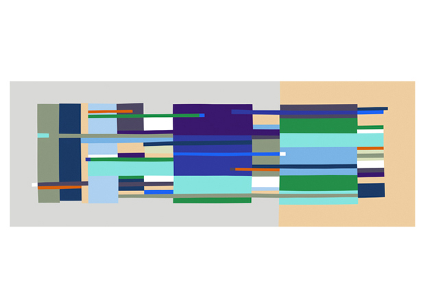
Find + Share // Paintings by Gudrun Åsling
I ran across these interesting paintings by Gudrun Åsling which relate quite well to what we've been doing in Visual Communications.


September 28, 2010
Helvetica Response / Other Film Suggestions

"Graphic Design is the communication framework through which these messages about what the world is now, and what we should aspire to. Its the way they reach us. The designer has an enormous responsibility. Those are the people, you know, putting their wires into our heads" - Rick PoynorHelvetica, the film does a great job of not only explaining the interesting background behind the font's creation but also the aspects in which type can be used properly and improperly. As well as the underlying and often overlooked reason of why we're designers and the responsibility we have as designers.
This movie in closing makes a really good point about how social networking is changing the world by allowing everyone to customize their personas on the internet. Through this customization people are starting to be come more aware of design in the world around them on such a grand scale that it could very well change a great deal of the direction in which design in a whole is moving. i.e. Design for change.
One of my favorite quotes from this movie:
"It's very hard to do the more subjective, interpretative stuff well. I can teach anyone from the street how to design a reasonable business card, newsletter, but if I bring the same group of the street in and play a CD and say, OK, let's interpret that music for a cover, well, 9 out of 10 people will be lost, and they're gonna do something really corny and expected, and one person's gonna do something amazing because that music spoke to them and it sent them in some direction where nobody else could go, and that's the area for me where it gets more interesting and exciting, and... more emotional, and that's where the best work comes from." - David CarsonHelvetica is one of those movies that I watch when I'm feeling uninspired and just need a real jumpstart. The excellent Album Leaf soundtrack doesn't hurt at all either.
A few other films I keep in my design jam rotation I would recommend to anyone who enjoyed Helvetica:

"Objectified, is a feature-length documentary about our complex relationship with manufactured objects and, by extension, the people who design them. In his second film, director Gary Hustwit (Helvetica) documents the creative processes of some of the world's most influential product designers, and looks at the creativity at work behind everything from toothbrushes to tech gadgets. What can we learn about who we are, and who we want to be, from the objects with which we surround ourselves?"

"Beautiful Losers, an endearing film about a tight-knit group of artistic friends borne loosely out of a legendary, now-defunct New York gallery called Alleged, heightens one's awareness of how cultural scenes can be forged and maintained through long-term documentation. Since the beginnings of this group in the early 1990s, filmmaker, curator, and ex-Alleged director Aaron Rose has undertaken the gargantuan task of forming and chronicling an American artistic community through museum shows, an art catalog from which the Beautiful Losers film borrows its name, and finally, a full-length feature documentary. Anyone who hasn't yet learned of the historical roots and aesthetic connections between graphic designers like Geoff McFetridge, filmmakers like Harmony Korine and Mike Mills, and street artists like Shepard Fairey and Barry McGee will now be exposed to this highly influential posse of creative people who have infiltrated mainstream media and advertising to renovate commercials, print ads, and art practice sponsored by corporate entities."

"Dithers is a "visual commentary" about contemporary American art, Dithers profiles thirty innovative US-based artists with an emphasis on graffiti, skate subculture and graphics. Followers of urban art will recognize many of the names, including Seen, Quik, Stash, Zephyr, Shepard Fairey, Dave Kinsey, and Ricky Powell; in addition, the DVD profiles emerging talents such as Bigfoot, Sam Flores, Jeremy Fish, David Choe, Dalek, Andy Howell, Dug One, Giant, Tiffany Bozic and others. Giving plenty of room for the artists to discuss their work, plus visual references of their art, Dithers is watchable and insightful all around."
September 27, 2010
Pantone + / - Emotional Responses
Bright Red 186 - Angry, Frustrated, Hot, Radiant
Vibrant Orange 1585 - Excited, Glowing, Vibrant
Bright Yellow 116 - Passionate
Earth Brown 438 - Safe, Protected, Secure, Hidden
Deep Blue 2747 - Sad, Worried, Depressed, Uncertain
Chartreuse Green 584 - Curious, Forgiving, Sincere
Blue Purple 267 - Crestfallen, Melancholy
Charcoal Gray 425 - Worn, Tired, Dying
White - Scared, Cold
Black - Vapid, Concerned, Afraid

Photo Color / Studies - Books in Enviroments
Here are my first round of photographs for our photo color / studies. I will be narrowing these down after I take many more into a cohesive collection.
My theme is Books in Environments.
The books I purchased from half price books particularly for their cover colors.
These are mostly outdoors but I plan on taking them into cafe's, and other kinds of stores as well.
I plan on burying, and suspending some in different color settings.
POST CRIT: Remember each page is a different color relationship. Get rid of the covers and print out color sheets to replace them with. 8 Covers total now. Watch for cropping in images when I shoot them. Make sure backgrounds are effective as part of the composition and part of the color wheel.


September 24, 2010
Necessity in Nature - Book Overview & Statement
How I Picked My Theme and Title
The title of my book is "Necessity in Nature" I derived my title from my original mind map composition. My subject "Nature" gave me "Life and death in nature" or "Life Cycle which once narrowed down gave me "Predator-Prey"
Nature > Life Cycle > Predator-Prey
Materials
My covers consisted of sheets of 6x12 birch plywood that I cut down to 6x9.
My backgrounds were all hand painted using Winsor Red Designers Gouache. I primarily used a wash effect to varying degrees depending on the page subject. For example a word like "Starvation" would use a very thin almost non-existant wash to give it a starvation or thinned out effect.
My found imagery I collected from half-price book's by raiding their National Geographic section. Many, many magazines were harmed in the creation of this book.
Statement
In my pages I have used my dot compositions to communicate my theme of Predator-Prey by realizing the idea of the hunter and the hunted in my dots physical characteristics and relative locations. Using the twelve principals of design I was able to effectively do this. For example using my first page Necessity the center dot has had parts removed and likewise to the dots touching the center to symbolize combat in nature and that death and survival is a necessity and form a union in nature.
My material selections I made based on the a source of images I was familiar with and knew I could find a wide array of different animal relationships and ecosystems. It would become boring and repetitive if I used the same kind of animals and settings. So thought out my book I have used woodlands, the sea, and the desert. My cover materials I chose because they directly related to nature. I wanted a wood or tree like feel to my cover. I toyed with thick hand made paper but it was too messy. By removing the type in my cover I was also able to give the illusion of a wound or damage has been done to my book a direct reference in relation to my theme. I think seeing it people would grasp the concept before opening the book.
The book itself flows from necessity which is the main focus of my book into competition. The page after that is terror which I lined up accordingly to show the next page through to help show the relationship between the two. In competition there is terror for the loser. In most cases death. Advantage comes next because the survivor of the prior conflict would have to be at an advantage of some sort to survive. The next page symbiosis related directly to the circle of life of which all nature is part of. his composition was created to show that relationship be it predator or prey. Now starting with consumption my theme starts directly heading into the grave. Consumption shows that there is a predator-prey relationship and someone will be eaten for another to survive. Mortal next shows that spiral to death. The visual elements show that there is no longer a whole. Starvation next is another case in the wild that could cause death. The type thins out as it continues much like an animal succumbing to starvation. Extinction is the final form of my book. The end all to end all. Like the backgrounds in starvation and extinction even the paint is spread thin.
Next time around I would better perfect my craft and my preparation for the use of other materials I might need to use from hard to reach sources. I would also further expand my concepts.
Pages

This cover will be lazer cut out.
Look for it finalized at our sophomore review or on my blog later
The image is just a place holder showing what would be reveled on the other side of my cover if it was removed. Ideally on the back of this birch cover sheet there would be another of my painted background compositions glued to it so that just red showed through.
My cover uses Alignment, and Positive and Negative Space.

Another view of how it would show through.

Page #1 - Necessity
Necessity is using Asymmetry, Scale, Compound Shape, Layers, and Correspondence.

Page #2 - Competition
There is a cut out in the center of this composition that shows through to the page below "Terror" to strengthen my "competition"composition.
Competition is using Symmetry, Scale, Compound Shape, Layers, Correspondence, Positive and Negative Space, and Proximity.
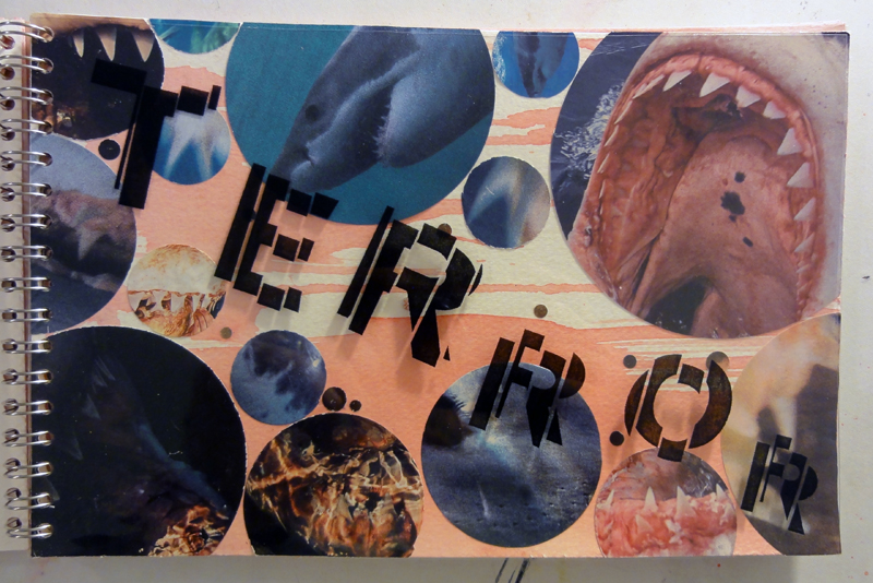
Page #3 - Terror
Competition is using Asymmetry, Scale, Compound Shape, Layers, Correspondence, Continuation, Repetition, Framing, and Proximity.

Page #4 - Advantage
Advantage is "taking advantage of" Competition is using Symmetry, Scale, and Correspondence.

Page #5 - Symbiosis
Symbiosis is using Asymmetry, Scale, Compound Shape, Layers, Correspondence, and Proximity.

Page #6 - Consumption
Consumption is using Asymmetry, Scale, Compound Shape, Layers, Correspondence, and Positive and Negative Space.

Page #7 - Mortal
Mortal is using Asymmetry, Scale, Correspondence, Framing, and Proximity.

Page #8 - Starvation
Starvation is using Asymmetry, Correspondence, and Proximity.

Page #9 - Extinction
This one is a hard one to see on here. The image is inside the "o".
Extinction is using Scale, Framing, and Asymmetry.


September 22, 2010
Book Project Process - "Necessity In Nature"
This is a quick overview of my successes and failures with this book project so far.

Cover Concept (Prior to lazer cut)
My cover I am content with. I'm looking forward to seeing what I can do using the lazer cutter to remove the title to revel the background behind it. My concept or reasoning for my backgrounds appearing "bloody" is nature itself. Or at least for the sake of this project a more visually interesting aspect of nature. This stems from my initial concept of life and death in nature. To close in more on the concept "Predator & Prey" in nature.

Red Gouache on Cold Press Paper. (Page Background Detail)
I created a wash to make my backgrounds.

First round of cover, and 9 page backgrounds.
These backgrounds were painted to support their word on the page by using varying levels of water mixed into the gouache. For example "Starvation" is almost white with little pigment.
Most of these are being replaced by new versions with levels of pigment that better represent and enforce their supported word.

First round of completed pages w/ completed typographic layouts side by side.
Most of these are being replaced with versions closer to my initial layout designs.
I lost myself in the imagery and changed the layout in the process to better fit what I saw when looking at the visuals w/ the type. This actually weakened the unity of type and image in my overall design by trying to make them work together when they have to first work alone to be capable of being successful together.
September 21, 2010
LCD Soundsystem "Home" Music Video by Funwunce
 |
| Check it out here |
The art collective I work with back home Funwunce just wrapped up their new music video for LCD Soundsystem's song "Home" off of their new album This Is Happening released earlier this year.
It came out pretty well so I wanted to share a little taste of HTX.
September 20, 2010
Book Concept
The following is a concept mock up for my "Necessity in Nature" book showing my cover and the first three pages.
My cover is Birch Plywood.
Background is hand painted red gouache on Cold Press paper.
My Font is Grotesque MT Standard & Bold.
My Imagery is found in various nature / environmental magazines.
Page one (Necessity) is a basic concept of how my images and background can work together. Page two (Competition), and three (Terror) is an example of how they they can strengthen each other compositionally if the pages are cut, show through, and overlap one another.
Please click the image to see it larger

Color Harmonies
The following are the basic color harmonies on the color wheel. This has already come in quite a bit on our current project that we're working on with color and photographs now.
My theme is Book's with a focus primarily on their covers set in the outdoors.
A complementary example of my theme would be A red book hanging in a green tree.
| ||||


September 18, 2010
Final Type Compositions From Beginning to End
My theme is Predator-Prey or Predication which I derived from the Cycle of Life and Death from my Nature Mind Map in Viscom.
My final nine words are Starvation, Mortal, Terror, Symbiosis, Necessity, Extinction, Advantage, Competition, and Consumption. You can see them below in order.
My type of choice is Grotesque MT Standard & Bold.
I have to say I've really enjoyed experimenting with these compositions. This project has defiantly helped push me out of my comfort zone in working with type. You have to respect the ability to properly use type to strengthen composition. I have to admit but after this project I'm looking back and seeing far too much of my type in personal projects not functioning properly. I mean sure it can look cool, but there's an art to it being more than that. By no means have I even really scratched the surface of typography but its exciting to learn.

Round 1 Type Compositions (Minus a few)
The above image shows my first round of compostions prior to crit and adjustments.

Round 2 Type Compostions (Narrowed down to 9)
The above image shows my 9 compostions after round two which have been adjusted and narrowed down after meeting with Marty one-on-one.

Final Compostions (Adjustments From Last Crit w/ Marty & Group)
Note* - The uncut sheets are the updated compositions
I know its kind of hard to make out on the screen here but the following adjustments were made.
Advantage: The "ADV" letters were pulled the left further to take "advantage"of the V shape in which I was able to create a moment by moving the smaller word "Advantage" into the vertex. Something I like about this change is the way the "advantage" word being in the vertex better defines my over all theme of Predator-Prey.
Extinction: The word itself which I tried to break up in round two of experimenting to give it a more death and decay feel I reverted back to one solid word at group crit request. Visually I think this does portray "Extinction" better. A solid form represents a one animal in the wild for example like an animal half decayed or just because its awesome to reference a Dinosaur sinking in a tar pit.
Mortal: For "Mortal" I closed in the letter forms closer together and moved the chunk I had pulled out of the "O" form closer back together. In crit it was pointed out this chunk removed made the "O" appear too much like a "C" which after being pointed out was very true.
Symbiosis: Overall I feel pretty good about this composition, but I was worried about the far left "Symbiosis" being too far to the left into the binding. I scaled back that one word to be safe.
All other's: General cleaning up of craft and preparation for transparencies to be made from them.
September 13, 2010

Typographic Metaphor Warm Up - "Clone"
Here is my process for my typographic metaphor warm up
*The final composition is not posted here but I think you see the idea.
I started with a grid system each row with its own letter from the word clone.
For example: | c | l | o | n | e |

Next I determined where the word Clone itself would be placed in the composition.

I then using my grid system I marked the letter locations accordingly.
Finally I placed my pre-cut Futura letters in the marked grid with an exacto knife and glued them down.
Perfect Painting "e" in "stem"

"e"

Final Composition
I really enjoyed working on this project. Working with gouache is always a blast.
My only criticism is there was a spot on the left side in the curve of the e that was a little off.
Subscribe to:
Posts (Atom)
