February 18, 2013

Degree Project - Week 4


Inspiration (social media app on boarding / built in user app introductory tutorials):


Flat design inspiration:


New Survey (To help map my scenarios/behaviors):

Dropmark

Questions for myself moving forward:
  • Should I also focus on those not as frequently social media users? This is a tool really for those people who have multiple networks like myself. I think the "Spark" category might be it. 
  • What are the psychological effects of social media. ie confidence building with "likes"?
  • How is my app going to effect that? Can it be plugged into the equation?
  • If this app is for the "Spark" kind of user it must allow for gathering of social media statistics for that confidence building moment. 
  • How can my app foster "trust" and "Control" - See below. 

Narrowing the scope: 

Focus on spark users. They are the average age of my sample (24), have an average of 1,000 connections to manage, belong to more networks, and is constantly online through their iPhone, iPad, or MacBook Pro. They contribute some of their self-confidence to social media accolades. 
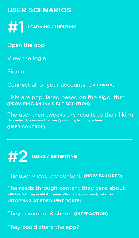
Additional Research: (Primarily for reference and research contribution) 

Two things social media users demand: (Control & Trust)
Something my app focuses primarily on providing. 
Reference: Aimia-Social-Media-White-Paper-6-types-of-social-media-users


Control: "Consumer desire for control over their personal information correlates to the amount of information they’re willing to share, the number of connections they make, the brands with which they engage and the reputation they build online. Control equals exposure: The more control a consumer perceives over their social media activity, the more likely they are to engage with a wider variety of social media networks."

Trust: Social media activity is driven by the level of trust consumers have in their ability to navigate social media, how much they trust their friends and networks with their personal information, and how much trust they  
place in the social networks themselves. The degree of trust correlates with consumers’ willingness to share information about themselves through social media. Trust equals participation: The more trust a consumer places in social media networks and their connections, the more likely they are to actively participate."

Fantastic presentation about social media and where its heading: 


Research regarding my sample age and choice of a mobile focus:


(Researched) User Personas:

Typical Onlooker (16%)
Age: 36
Income: $85k
Education: College Degree
Household: Married, 2 Children
Connections: <100
Networks: Facebook, Youtube, Linkedin, etc.
Tools: PC, Android
Frequency: Daily
Participation: Low
Exposure: High
"I use social media to reconnect with people and typically observe others. I share almost nothing."

Typical Cliquer (6%)

Age: 47
Income: $95k
Education: Graduate Degree
Household: Married, 1 Child
Connections: <100
Networks: Facebook, Youtube, Linkedin, etc.
Tools: iPhone, PC
Frequency: Daily
Participation: Medium
Exposure: High
"I use facebook to post about my day. I like pictures, and I love to comment on my friends' pictures and videos."

Mix-n-Mingles (19%)

Age: 29
Income: $95k
Education: Graduate Degree
Household: Married, 1 Child
Connections: <200
Networks: Facebook, Twitter, Linkedin. 
Tools: Mac, iPhone
Frequency: Multiple times a day. 
Participation: High
Exposure: High
"I use social media to interact with family and friends–including new friends i've met online."


Typical Spark (3%)

Age: 24
Income: $80k
Education: In grad school. 
Household: Lives with partner. 
Connections: <1,000
Networks: Facebook, Twitter, Linkedin, Blogs
Tools: iPhone, iPad, Macbook. 
Frequency: Always online. 
Participation: High
Exposure: High
"Social media enables me to meet with my regular friends and meet new ones. It increased my confidence and allows me to enjoy my life."

February 17, 2013

KCAI Wayfinding - Week 3

Please see Ashley's blog for the most recent blog update!

This week we did a lot of refining within our signs and placements. We started to think about where the signs would be located, what the sides look like, the dimensions, what they might look like at night, etc.

We began taking context shots and decided to lead the viewer from the street outside of KCAI (beginning with the street signs) and working their way into the building. Each photo hints at the photo/sign that follows.

At night, we imagine the text being lit up as well as the transparent triangles, making he signs still easily viewable from a distance in the dark. In the side view, you'll see that the front and back planes exist as separate pieces when coming from the base, but are connected with a thin piece of metal when higher up (as if it were floating).

We've also began laying out the final book and sequencing how it will be read through. The aesthetic of the book alludes to the angles/triangles in our way finding experience and has a clean, architectural feel.

New Street Sign Design:


Height Comparison: 


Sign Dimensions: 


Updated Map Design:


Night View:


Example Placement:


Book Spreads:


February 13, 2013

Degree Project - Week 3

Project Objective:

The objective of my project is to create an iPhone application that will curate multiple social networking applications into a single app, with an emphasis on the people who matter most to you and the content those people create. 

Moving Forward:
  • Create a new survey based on the social networking content that matters most to them / Studying user behavior. 
  • Focus on defining user personas.
  • Based on the feedback of my survey define the scenarios. 
  • Narrow the scope of my project and don't over extend myself. ie. Windows 8. (part of why I want to take a crack at this is because a lot of the companies i've been looking at are in need of this kind of experience)
  • Figure out what features I want to show and those I just want to elude too. This isn't supposed to be a swiss army knife. 
  • Think about how I want to present the final product. 
  • DREAM BIG DAMMIT. 
Presentation:

Degree Project Final Presentation #1 by Eli Brumbaugh


Updated & Revised Timeline:


Research on Mobile App Usage.


February 11, 2013

Degree Project - Presentation 1


Video of animated transitions.

Keynote from Eli Brumbaugh on Vimeo.

Interfaces Aren’t a Descriptions; They’re Stories


—
Interviewer:
Do you make a distinction between “flat” and “round” characters?
Hemingway:
If you describe someone, it is flat, as a photograph is, and from my standpoint a failure. If you make him up from what you know, there should be all the dimensions.
—
This is why this conversation goes on, why it is worth having. The desire for more honest  (or at least more interesting) interfaces and a certain aesthetic have been lumped together and called “flat design”. I’m concerned with the deeper drive for mor pure interaction design, and there is more to it than altering your style or changing your habits in Photoshop. There is a fundamentally different process, something genuinely unique from print design. That difference goes much deeper than tools, and even defies directly translatable principles. “What’s good for print is good for digital” doesn’t hold up as a mantra of ‘flat’ design.
Much of skeuomorphism is about transcribing the physicality of real world interfaces into flat interfaces. It’s a pretty banal process to search for the real world analog to the idea of toggling a setting, or amplifying volume, and then assigning to that a flattened representation of a three dimensional interface. It is description, it is flat, as a photograph is, and it is a failure.
Flat design is the opposite of flat. This honest / native / natural / essential / lean / minimal / truemorphic design wipes the paradigm clean from banal visual descriptions. It’s is not limited by what you can describe to the user about the interface and experience with photographic accuracy. It is made up, from everything you know, about how people behave and flow and interact, and most of what you know is left unsaid, unrepresented, untranslated, and undescribed. Description is flat. Hemingway left almost everything out, and rather than describe a scene, he tells a story, just as we tell experiences.  In making it up, “there should be all the dimensions.”
Flat design is not flat. Screens are flat. The interfaces within them are dynamic. They have real depth — depth through time, depth of experience, depth of emotion. Faux spatial depth is the least interesting possibility of a digital, multi-touch interface design. Don’t translate interfaces. Make them up, with all their depth and dimension.
-----------
Thought about this a bit more and had some thoughts on the aesthetics of flat design. 
I wonder if the aesthetic of flat design is just a signal to the user that this is something different. Rather than the digital format informing only the design process, it is also a desire for it to directly inform the use as well. It’s disorientation so that the user might be reoriented. It is a way for the designer to speak through the interface and say:
“This is not a dashboard, a keyboard, a console. It is not a toggle, a button, a switch, a handle. This is not mechanical.
But it is interactive — moveable and mutable. It’s some of what those other, physical things are, but not entirely, and in some ways less, in many ways more.”
As an aesthetic, flat design’s purpose is to signal to the user as they walk in the door that things are different here. What I see in these “flat” designs is a deliberate effort to pull users along rather than wait for them to get there on their own. Can users grasp something new without the crutch of metaphor? Will they naturally develop new understanding and behavior, or do we need to move them forward?
Metaphor is not inherently bad. It’s a teaching tool. It’s great for transition. But forever burdening the digital format with physical metaphors is like putting a Shelby Cobra V8 engine in Fred Flintstone’s car and telling him to still push along with his feet.

KCAI Wayfinding - Week 2


This week, Ashkey and I sort of redeveloped our concept from last week. We're still focusing on KCAI's "energetic", "active" and "artistic" spirit through the dynamically shaped signs, but the signs shapes have based on a new, triangular-shaped grid system. This system gives the sign more of an organized structure, but allows us to still keep each sign unique from the rest. We've also added more depth to the signs by giving them this an overlapping, oragami-like structure, and sometimes even playing with placing the type on the two separate layers, lining up only when someone's looking at the sign with right angle. We didn't want to mess with this feature too much though, since way finding signage should be read easily. The white triangles (made up of many small triangles) within each sign are meant to be transparent glass, alluding to the idea of it being incomplete, or a work in progress. These changes focus on the students evolving and transforming through their school years here, as well as the never-ending process of making art itself.


As you see below, we've developed a few different color systems for this way finding concept. We're still working on our final map, but we're thinking about having the outside signage one color, that way KCAI easily recognizable by outsiders, and then alternating to the other colors indoors, which could allude to it being more of a creative space. 

grid system

colors

main sign - glass/no glass

other signage

February 6, 2013

Degree Project - Week 2


Realization: 

We can reward power social media users by giving them a better curated sampling because they have more information in which we can pull the "content profile"from! More Networks = Clearer Picture of that User!

Key things this app has to accomplish:
  • Cut through the clutter!
  • Discover the content that truly matters!
  • Share Content effectively! - You're able to target just those groups of people who you know care the most about the content you're sharing with them. 
  • Get more enjoyment from using it vs competitors! - Open 1 app instead of 8. 
Link to Survey: I believe this will help me identity my primary audience and the audience I'm missing and need to get a sampling from. This app is for everyone. But for the scope of this project I need to identity my primary audience. Its tough because power users would want it to customize their experience. Where my less than tech savvy mother might want it to cut down on how overwhelmed she is with social networking. 

This survey will hopefully answer the questions around:
  • What devices they use most often. 
  • How many social networks the average person uses.
  • How many social apps they have on that device. 
  • Their most frequently used social app.
  • Their least used social app, and why.
  • Do they use any apps that are out there to augment their current social app experience like Gabi. 
  • How they feel about apps using other apps for authorization. (My backend to my app)
  • How would they group their "friends" or "connections"
  • How would they group their social networks.
  • What kind of customization they would like to see?
  • What annoys them the most about current networks/apps.
  • How much experience they have.
  • If they're from a creative field, etc.
  • What kind of users they are. 
  • Favorite kind of prospective tech.
  • They're super awesome for filling this out. (no choice) 
New Project Progress Reviewers:

Cameron @ P3
Luis, Molly, Sean @ Mutual Mobile
Brandon, Cheryl, Josh @ Huge

"By identifying casual versus power users, organizations can start to segment user behaviors as they relate to traffic, social media and advertising..."

Interesting Reads: 
  • http://socialmouths.com/blog/2012/06/05/curate-content-from-your-smartphone/
  • http://blog.hubspot.com/blog/tabid/6307/bid/33698/Facebook-Tests-Pinterest-Style-Feature-Called-Collections.aspx
  • http://www.digitaltrends.com/mobile/facebook-updates-nearby-feature/
  • http://blog.metaroll.com/2011/12/26/curating-flipboard-content-two-varieties-of-personalization/
  • http://www.curatecontent.com/
Highly Recommended Curated/Tailored App Audit: 
These news apps have to regulate a massive amount of content sometimes along side social content. They have been highly informative in ways that established apps have tailored and curated app data.
News360:

"Digging into the preference options available in the iPad app is like unwrapping the layers of an onion, you can just keep going."

  • Curates content by pulling information from your social media networks. It reads into how you interact with your contacts, to get to know you. Once it has an idea of your personality it then makes predictions and recommendations of what you'll want to read. 
  • Incredibly high degree of customization 
  • "Digging into the preference options available in the iPad app is like unwrapping the layers of an onion, you can just keep going."
  • There’s also a Pandora-like mechanic to the application, so it will learn from you the more you use it and from the news stories you are reading, sharing, and liking — as well as those being discarded. 
Flipboard:
  • Simply pick a few topics and your Flipboard is instantly populated with the news you care about. 
  • Organize content by taping and holding any section title on your Flipboard to rearrange the order. 
  • CUT THROUGH THE CLUTTER (Auto organize, limits your viewing, frequent interactions) 
  • You don’t have to waste time reading hundreds of irrelevant tweets or articles, because this tool organizes your content for you. 
  • Limit your viewing to what you want to read and see the most. 
  • This app lets you see the posts of the people you interact with the most, limiting endless Twitter feed scrolling. 
  • SEE MORE CONTENT (Content cull and cut, No extra clicks) 
  • Content curation tools usually cull and cut down the amount of information you see. 
  • Flipboard curates in a different way, pulling together all article elements so you can quickly scan text and images without extra clicks 
  • NETWORK EFFICIENTLY (Quick sharing, Share and comment all in one place) 
  • You can use Flipboard to share comments and reply to your network all in one place. 
  • When your friends or business contacts post photos on Flickr, you can see their latest posts. 
  • If you see an article that would benefit someone in your network. 
  • READ THE IMPORTANT NEWS FIRST 
  • Timeline feature that lets you see how long ago an article or page was posted. The built-in timeline helps you save time when searching online.

Calendar: 


Imagery:

Notes

Notes

Notes

Insperation

Insperation

Insperation

Insperation


February 4, 2013

Wayfinding Concepting - Week 1

Group project post on behalf of myself and Ashley Einspahr.

Our concept revolves around a consitered but simple approach. KCAI has been described as "Energetic", "Active", and full of "Artistic Spirit". We wanted to capture the energy and activity that KCAI embodies in their brand by reflecting it in dynamically shaped signage. To capture that artistic spirit, each sign itself is unique in its shape like students and faculty at KCAI.


We've careful considered the placement of our signage based on the reading on programing, thinking about the viewers line of movement and sight, directional signs and decision points, and identification signs to confirm arrival. 

In terms of color as you will see below we have experimented with using full-color, bold signage and complimentary, subtle colored signage. 


Outdoor wayfinding signage near Vanderslice.
This sign would welcome first time visitors, direct, and inform them. 


Indoor wayfinding signage inside Irving.


Entrance signage.


Building identification signage.


January 30, 2013

Career Goals & Strategy


Career Goals:

Through my time at KCAI and my own personal experience freelancing as a Graphic Designer and Illustrator I have come to realize many things. I think the biggest one of these is the fact that I want to pursue a career as a interactive designer. I would like to primarily take over the role of preferably User Experience Designer or if necessary Visual Designer. I have discovered a strong passion designing for the screen. Be it iPhone, iPad, Web, etc. I believe that mobile is the future and at this point in time we are still able to transition from students to professions at an incredible time when there are no real masters of the craft and there is still room to make a big impact if you're willing to take the risk. I'm hopelessly addicted to technology from wireframing to implementation. 

Strategy: 

I will have interned at four locations: Design Ranch, The Nelson-Atkins Museum of Fine Art, Mutual Mobile, and Propaganda3 by the time I graduate. Two of which I greatly hope will give me offers post graduation. I am currently in contact with my last internship location at Mutual Mobile in Austin, Texas which I really enjoyed is currently rolling out the Directory app I created and designed. I am also in contact with several employees of Huge Inc. in NYC. I have just applied for the Huge UX, and VD School that I hope I will be accepted to. If that two month crash course program goes well I will have a shot at transitioning into a full time employee. I also plan on applying to a hand full of other locations around the country. I am not against staying in KC if the job is right, but my adventurous side is calling me to move on to the next place. 

I would be happy to accept the role of Associate Visual Designer, more preferably Associate User Experience Designer. I would be willing to cut my teeth as a production artist if need be because I want to work my way up through a good company. If I start at entry level, I would like to transition from Associate Designer to designer in 1 year. I would like to jump from Designer to Senior Designer in another two-three years. The firms i'm looking at and talking with are growing fast enough that I believe that this would still be possible. 

Degree Project - Week 1


Key Articles Found: http://www.teehanlax.com/blog/going-down-the-right-path/

What is the problem:

There are so many social networks and supporting apps to keep track of these days it becomes difficult for people to keep tabs on the content and people they care the most about. 

What are the solutions (ie. explorations, ideas, experiments, speculations):

My solution: Is to create a supporting application that will automatically curate and organize  multiple mobile social networking experiences into one a single better user experience. *Ideally this would be accomplished in the background, but if needed fully editable by the user. 

"Something that can do its own thing in the background is great" - connecting the film

This can be accomplished through:
  • Algorithm - ie. Facebook - Edge Rank, Google - Pagerank
  • User Control - In app customizing. ie. selecting people within those networks and turning off and on what sites you want to see their work from. ie. Parent, wants to see their child's social networking activity more so than that of a friend they just talk to once and a while. Also the idea of grouping. ie. family members, etc. 
  • User Centric Design - Focus on the wants and needs of the users based on my research. 
  • Smart Design - How? Figure it out Eli. 
Research Moving Forward - (testing the validity of my RESEARCH assumptions): AKA bust out the sticky notes!

Dropmark Inspiration Folder
  • Personally survey how many networks am I on? Where am I overwhelmed? What content matters most to me? What would I do differently?
  • Creating a survey to pinpoint what content matters most to the social networking user. 
  • Survey the usual paths/features that the social media app user uses daily?
  • How would they group their friends together?
  • How would they group their social networks together?
  • What kind of options would they like to see? 
  • What kind of options would they assume would be there? - Blind questions / Stickies game! - Focus on this later on. 
  • Technological Audit of existing algorithms - how do they function and determine the order of importance of user information. 
  • Technological Audit of social networks with apps that carry across multiple platforms. Is Windows 8 practical? If vector based, responsive design it should carry over. 
  • Technological Audit of future technology that could be used by social networks. ie. seniors, connecting house hold devices, augmented reality, 
Personal Project Goals/Questions: 
  • Future Proofing -  How can this still function 5-10 years from now?
  • Ambition - Is this ambitious enough? What am I offering thats going to break the mold?
  • Innovative - How can I create an innovative new experience? Is this through the concept? Through a new UX experience?
Design Concepts - (testing the validity of my DESIGN assumptions): 
  • Responsive Design - Would allow for use across multiple platforms. ie. iPhone, iPad, Windows Phone, etc.
  • Vector Design Standards - Moving into 2013, ideally dropping skuemorphic design would allow for a more neutral non-iOS centric style. 
Meeting Notes 1/30: 

Currently Active Survey

Audience Needs / Motivation / User Types

Create a meaningful description of my audience. 
Find different kinds of people.
When do they need certain kinds of content?

Pick some users!
Create a bad ass survey!
Don't hey bogged down on little details!
This is all prospective tech! SPECULATE!


Process Book Layout

My degree project is focused on people and how they can benefit from a well managed mobile social experience that functions behind the scenes. This of course can still be edited at any time by the individual. 
I'm looking forward to intensive research and wireframing sessions which is why my book has additional pages dedicated to those sections. 
Please keep in mind the folio is as such because I will be turning this into an interactive iBook to display in the future using an iPad. 
* This is a work in progress. 
* It will be awesome because it has to be. 

January 28, 2013

Degree Project Question


Project Code Name: Social Media Aggregator

What I Want it to Do:
Digest and break up the social media user's various apps / networks into an organized and curated experience. I want it to possibly use an algorithm like Google Search "Knowledge Engine" results or the Facebook "EdgeRank" algorithm to determine what content should be displayed. I want the user to be able to see these information once it has been gathered. The use should then be able to verify (accept) or correct the percentage in which each network is displayed. Perhaps in the form of a slider bar. I want it to be responsive, and work across smartphone, tablet, and desktop (in the form of a Windows 8 app). I want it to be capable of surviving rising and falling social networks as they come and go. Future proof. 5-10 years from now will this still be able to function? I want the user to be capable of organizing the content into group's like Marty has suggested (ie Moms, Friends, Design Students). 

Old Question: 
"How can an iPhone application allow the 18 to 34 year old social media app user to curate their mobile experience by selecting and combining only the content that matters most to them and their lives from people they care the most about into one application."

New Question:
"How can an app allow the social media app user to curate and organize their mobile experience through an intelligent algorithm paired with a user controlled adjustment system in which the user can highlight and combine only the content that matters most to them and their lives from people they care the most about into a single application?"

Next Step:
Auditing my classmates and other social media users usage, concerns, and desires. 
ie. problems, potential solutions: explorations/ideas/experiences/speculations. 

Massive Note to Self:
"This is an important time in which I can really push conventions. This is the time to explore and imagine how this could function in 5-10 years from now. Do NOT get bogged down by audience issues."

Previous Presentation: