
March 9, 2011

March 5, 2011
Current Perspectives - Keetra Dean Dixon
Best current perspectives yet!
During this lecture I found what I thought were a large amount of similarities between myself and Keetra Dean Dixon. For example we both enjoy including illustration in our designs. She also sees the importance of being well rounded and diverse in her capabilities as a designer. As soon as I finish my BFA in Graphic Design I plan on expanding on it by attending grad school for something along the lines of interface or web design. There's just so many interesting branches of design that we can take part in. Her one-a-days were really intresting and inspiring. It seems like a really good way that I can stay up to date with my own personal projects. Her use of java scripting and illustrator along with Photoshop and automator brings to light some new possibilities to explore. She also mentioned body storming or brain storming a space by being in the space of where the installation will be installed and pacing the space making mental notes to create a plan of attack. The way she approaches collaboration really makes me want to work on a large team project. I was really impressed by her large hacked constructions and customized mini extruder. This brings something to mind I think I forgot about when I first went into design was the enjoyable fine arts aspect of creating large scale hand objects and set creation. There is absolutely no reason at all why we as graphic designers cannot transcend other forms of media and apply out insight and formula to the problem at hand. I want to end this post on a few key things that she had given up as advice at the close of her lecture. "take risks" "mess up more" and "don't be so timid and scared"


March 3, 2011
March 2, 2011
KCAI Print Center - Branding & Sustainable Design Project
I do my work study in the Print Center here on campus. Since I started last August I've been talking with Aaron the print center manager about some ideas to promote the print center. At the moment I have put together a simple blogspot with all of the prices and information about the center, and a new recycled transportation box, and a few designs to help advertise the center.
One big concern Aaron and I had was how to make the print center more sustainable. Below I have outlined some of the design work and methods used.

Print Center Transport Box Wrap
We had a bunch of left over 44" x 4.5" boxes that the plotter paper comes in. So Aaron and I decided to reuse them as reusable transportation boxes for student prints. The printer ink being used is expired we're using up instead of throwing out. Black and various layers of opacity is the only color I'm working with because we don't want to waste color ink for any advertising if we can avoid it.
On a side note once this expired ink is run, I will be reverting to a light shades of gray and less black mode of design. As well as recycled paper.
My concept behind this design was to create an informative advertisement that resembled a spool of paper on paper roller spindle behind the plotter. The information being listed is so important because at this point I don't think the center has received enough promotion. Students rarely know when its open or where its located at. These informative boxes can help promote, inform, and protect.
On a side note all test prints, mess up's, and waste prints are being saved up for a recycled sketchbook project. So I encourage everyone to leave your test print in the center after you give it the go ahead.

Print Center Blogspot Design

This is a simple homepage place holder image on the Print Center Blogspot as a single image post.

Sidebar object.
February 28, 2011


February 25, 2011
February 24, 2011
Intro-Active Postponed Until March 3rd!
The last Intro Active was really informative. Don't miss out tonight!

Intro-Active is a topical lecture series and moderated discussion specially developed for traditional print designers, new professionals and students interested in transitioning to or gaining a foundational knowledge of web design.
A strategic view of web design will be introduced over the course of 4 sessions. At each session selected speakers — from social media and usability experts to interactive designers and developers — will give their points of view as experienced industry professionals and arm attendees with resources, vocabulary, inspiration and confidence on relevant web design topics.
Intro-Active 2: Crafting Interactive User Experiences
This session will explain user interface and information architecture methods and help define their relationships to designers and the web design process
A strategic view of web design will be introduced over the course of 4 sessions. At each session selected speakers — from social media and usability experts to interactive designers and developers — will give their points of view as experienced industry professionals and arm attendees with resources, vocabulary, inspiration and confidence on relevant web design topics.
Intro-Active 2: Crafting Interactive User Experiences
This session will explain user interface and information architecture methods and help define their relationships to designers and the web design process
Guest Speakers
Jeni Yakel, Associate Director of User Experience at VML
Jason Rincker, Senior Visual Designer at Sprint
REGISTER
Jeni Yakel, Associate Director of User Experience at VML
Jason Rincker, Senior Visual Designer at Sprint
REGISTER
PJ 2 Icons - First Round

Nintendo NES System (This is being edited with a more stylistic approach. See the glasses below for an example)

Black Glasses (This is the basis for the revisions to my other images)

USB Flash Drive (Sharper angles are being added)

TV (New angles are being added)

Energy Drinks (This will be replaced)

Book (This will be replaced)
February 23, 2011
The Seven Deadly Sins
 |
| I created a layer association chart based on what tyler mentioned in class today about the different layers of association regarding image. The other form is a scenery chart for mocking up / storyboarding my photographic composition in order as they would appear in the website. |
Typography:
Garamond, or
hand drawn typography. I believe that my concept of clean and simple
compositions would be strengthened by a serif typeface like Garamond or my own
take on something similar.
NARROWED DOWN CONCEPTS
- Remnants: A series of images based on the seven deadly sins. Each image would show the “remains” of the night before, or the aftermath of an event. At times small signs of people exiting the scene may be appropriate. For example a hand swinging at your side as it falls to your side as you exit a room.
- Animals to represent the sins: Gluttony would be a pig. Anger could be a bear. Envy a domesticated animal like a dog. Sub-concept: People as animals? Masks? Props?
- Hands to represent the sins. I would use hands interacting with other hands. Using some props such as knives etc.
- Use different kinds of foods to represent the different sins. If needed also in various states of decay.
- Paper craft: Creating abstract compositions that represent each sin.
- A versus concept: Pitting the sins against the virtues. I would use images depicting the struggle through interesting placement and interaction of objects. Lust:Chastity, Gluttony:Temperance, Greed:Charity, Sloth:Diligence, Wrath:Patience, Envy:Kindness, Pride:Humility.
- (Might be too far off the path) Photograph: Book of Proverbs, it is stated that the Lord specifically regards "six things the Lord hateth, and the seventh His soul detesteth." Namely:
o A proud look.
o A lying tongue.
o Hands that shed innocent blood.
o A heart that devises wicked plots.
o Feet that are swift to run into
mischief.
o A deceitful witness that uttereth
lies.
o Him that soweth discord among brethren
Photographic
ConceptS
Photographic Concept: Different shades of color filters
imposed over the image or cast in a colored light. For example: Anger could be
red, and envy Green.
Photographic Concept: Possibly use a Polaroid camera, or cross processed images if I can get access to C-41 chemicals and slide film.
Typographic Campaign - Billboards & Buswrap Final Revisions
This is the third and final round of revisions for my billboard and buswrap section of my typographic campaign.
My final revisions after our last crit:
I added my web address to all sides of my bus.
I enlarged the size of the website address on all sides of the bus to make it more visible.
I adjusted the size of my texture on the back of my bus's to make room for the web address.
I took a note from the class crit and resized some of the quotations on my bus wraps and billboards because some of the type was getting too close to the sides of the bus / billboard.
On the last bus wrap I adjusted the rotation of the texture to work both vertically and horizontally instead of trying to force one idea I discovered both together work stronger as a composition.


Tecumseh Final Poster

Above is my first version of my Tecumseh poster.
Just a quick break down of the symbolism. The separate shapes and chief headdress represent division among the tribal leadership between Tecumseh and the Prophet which helped lead the Shawnee towards destruction. The red and blue shapes along with the off white background represent the American flag also as a source of conflict. The two guns one of British nature, and the other of American rustic design who the separate factions and loyalties that pulled the two apart.

Above is my final poster for Tecumseh.
IMAGERY:
The dream catcher represents his dreams of uniting the remaining native american tribes against the American expansion. The dager represents the betrayal and deceit of his brother that crushed his dream.
The heart torn in two represents the heart of betrayal. The two opposing beliefs of pacifism versus open warfare in the Shawnee tribe.
The red and blue heart pieces on the aged white background represents the american flag.
LIGHTING:
My lighting was focused on the dream catcher illuminating his life's work.
I created this effect by using the centered spot light in the photo room.
Along with another soft box to diffuse the light near the top of the poster to remove extra shadow.
REASONING:
I believe that this is the right image to portray for the museum's exhibit because it highlights Tecumseh's legacy, and ultimately his death. Considering not much else is known about his life outside of the imagery that I covered, and no physical image of him have ever been found.
I believe that this poster would attract people to see the exhibit based on their personal relation to struggles in one's life and celebration of a cultural icon of the American Indian.
POST CRIT:
Major flaw, I neglected to enlarge the title of the poster. Tecumseh is missing clearly as a title of the exhibit.
The lighting could be a little less yellow post printing.
February 21, 2011
Dieter Rams' Ten Principles To "Good Design"
Rams' Ten Principles To "Good Design"
"Recently Rams' work has been reprised in the context of its influence on Jonathan Ive of Apple Inc. In the documentary film Objectified, Rams states that Apple is the only company designing products according to his principles."
Good design:
- Is innovative - Rams states that possibilities for innovation in design are unlikely to be exhausted since technological development is always offering new opportunities for innovative design. He also highlights that innovative design always develops in tandem with innovative technology and can never be an end in and of itself.
- Makes a product useful - A product is bought to be used. It has to satisfy certain criteria, not only functional, but also psychological and aesthetic. Good design emphasises the usefulness of a product whilst disregarding anything that could possibly detract from it.
- Is aesthetic - Only well-executed objects can be beautiful. The aesthetic quality of a product is integral to its usefulness because products used every day have an effect on people and their well-being.
- Makes a product understandable - It clarifies the product’s structure. Better still, it can make the product clearly express its function by making use of the user's intuition. At best, it is self-explanatory.
- Is unobtrusive - Products and their design should be both neutral and restrained, to leave room for the user’s self-expression. Products fulfilling a purpose are like tools and are neither decorative objects nor works of art.
- Is honest - Honest design should not attempt to make a product seem more innovative, powerful or valuable than it really is. It should not attempt to manipulate the consumer with promises that cannot be kept.
- Is long-lasting - It should avoid being fashionable and therefore never appears antiquated. Unlike fashionable design, it lasts many years – even when the trend may be in favor for disposable products.
- Is thorough down to the last detail - Dieter Rams states that nothing must be arbitrary or left to chance in the design of a product since care and accuracy in the design process show respect towards the consumer.
- Is environmentally friendly - Good design should make an important contribution to the preservation of the environment by conserving resources and minimizing physical and visual pollution throughout the lifecycle of the product.
- Is as little design as possible - Dieter Rams makes the distinction between the common "Less is more" and his strongly advised "Less, but better" highlighting the fact that this approach focuses on the essential aspects thus, the products are not burdened with non-essentials. The desirable result would then be purer and simpler.
February 17, 2011
Print Center Can Take More Print Orders Today ( Image Class )

I will be there working from 5:30 to 7:30 to help out so come by if you wanted too but were concerned it was too late!
February 16, 2011
Typographic Campaign - Buses & Billboards Iterations Round #2
I will be moving forward with my red iterations after critique today.


Post Crit Decisions: (These pertain to the Red iterations only)
- I will be replacing my thin typeface with a still visibly thin type but bold enough to be legible for the application on the bus.
- Instead of using white box shapes to show a reversal of contrast for emphasis and second meaning (which allowed for the reader to receive the message even if they could only catch a part of it moving quickly in a moving vehicle) with a BOLD type instead to give the same visual appearance.
- If I choose to rotate the kit image I must do so on all of them. I'm still torn on to do this or not. I think having the kit texture being turned at an angle helps portray speed and motion but at what cost to my other two designs which benefit from being straight on horizontal.
- The first bus skin will have to be adjusted because it uses two separate kit items. Michael pointed out I could simply use the circle again at a larger scale which should resolve the problem.
- The second red bus skin I will have to make the choice to either rotate the kit design horizontal or vertical. After crit I believe there is no question to making the horizontal choice.
- Personally I think that the first concept is the strongest but we'll see once the next round of iterations are complete.

My current color pallet


February 14, 2011
Typographic Campaign - Billboards Iterations Round #1
The concept of my campaign is "Graphic Design as a means to improve society through inspiration".
My revised quotes are:
- "Good art inspires; Good design motivates."
- Otl Aicher - "Design is about making things good (and then better)and right (and fantastic) for the people who use and encounter them."
- Matt Beale - "Design creates culture. Culture shapes values. Values determine the future."
- Robert L. Peters
The most successful of these designs was the first and third red composition, and the third of the white compositions according to critique.
I will also be moving forward with revisions and implementation of more of my kit items.
 My pallet and resources |


Appropriate Quote For Our Current Typography Project
"Art has to move you and design does not, unless it’s a good design for a bus."
- David Hockney
- David Hockney
February 13, 2011
Refined Digital Explorations + Typographic Experiment
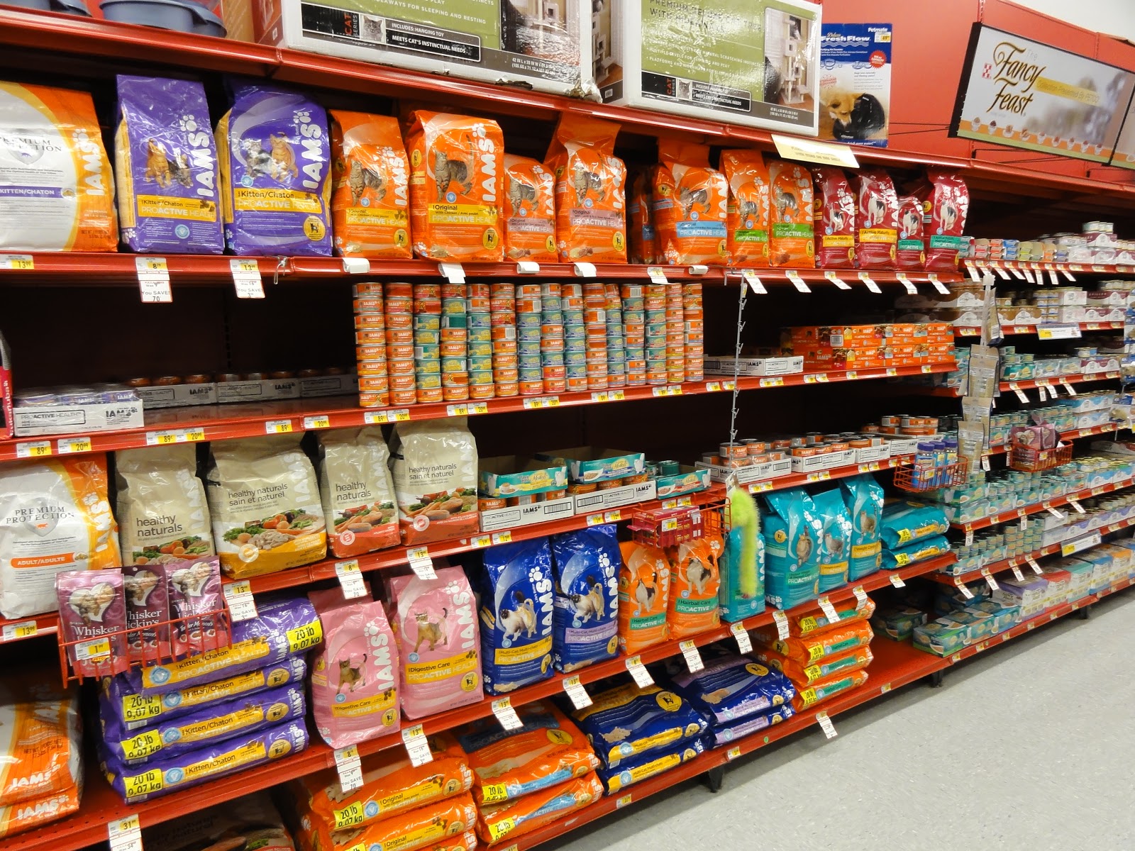
Typography Experiment using different color cans of cat food to create repetitive letter forms.
Needless to say I got some crazy looks doing this one.

H's

I's
A's

Anomaly

Concentration

Direction

Gradient

Repetition

Space #1

Space #2

Texture #1

Texture #2

Texture #3 - Coffee (W/ and without creme)
Subscribe to:
Posts (Atom)
