May 11, 2012
May 9, 2012
User Experience Reflection
UX was a class I was really looking forward towards and it didn't disappoint. This class has enriched my ability to not only understand my audience but really take their concerns, and wants into consternation on a whole new level. By considering their values, goals, and traits. After the Urban Chicken research book we created applying it to my Information Architecture Flock iPhone Application project which I believe will greatly improve my ability to create apps tailored to those users with well researched UX methodology that we've learned. It was great to see how each project as a separate piece of the puzzle reviled something new about user experience and how what we were doing became a greater part of the whole. Like I mentioned utilizing it in IA class at the same time was excellent. Moving forward I am excited to see how much what we've learned in this class will help improve my course work and my own personal work with the coming summer, and senior year!
Sculpture Explorer Passport Final Documentation
While working on this collaborative project for the Nelson-Atkins I experienced what I would have to say has been the best exposure and experience that I have had thus far regarding utilizing user testing, and client feedback. Sure the project was a lot of fun to create, this actually really being my first time to design for children I have to say it was a blast... But what blew me away was how as time progressed through the project and we jumped design hurdles and witnessed the project evolve based on that testing and feedback it became something we were really both proud of. Towards the end of it we felt confident and proud of what we had created regardless if it was selected or not. That feeling is one that I want to continue to strive for as my career here at KCAI unfolds.
Working collaboratively was also a really good experience for this project in particular because of the different skill set Michael and I each had and strived to divide up select tasks to best utilize the other. A challenge also arose from this collaboration and mixed skill set... We had to blend our separate styles together into a seamless design that appeared designed by a team and not just two sperate designers. Regarding the design working on something for children started off as quite a challenge. We wanted to keep the work attractive to parents but also to their children. Finding what we would call simple sophistication was an eye opener to designing for this particular kind of experience. Designing way finding became one of the biggest challenges we faced and where user-testing day really helped us out a lot. Michael stuck to his guns and really made that perspective map work with the feedback we received. By not abandoning our ambition to create a perspective map instead of a top down I think really helped the map stand out. Utilizing a mini top down map along side it allowed us to not only break the mold but also hold on to what was successful before. Moving forward I would like to spend more time with the user, and keep pushing to better implement the cares and concerns of the user I have in mind.
Presentation:
Context Shots:
User Testing Day Shots:
ADAA Submissions + Images
Here are my first three entries into the Adobe Design Achievement Awards. I plan on submitting a few more before the deadline.
Chocolove 100% Guilt Free Chocolate
Chocolove is a product re-design using an alternative mode of appeal. The original being a solely pathos based product has be re-designed into a primarily logos and secondary based pathos product. I wanted Chocolove to allow the viewer to know that it was going to taste as good as it was for them to eat. To do this I created a corresponding infographic of ingredients. There is a corresponding icon set to reinforce the benefits of chocolate and several interesting facts on the front cover.
The objective of this project was to re-design an existing product package, using an alternative “mode of appeal”. Chocolove was initially a pathos based product. For the purpose of this project I re-designed it to be based on a logos mode of appeal.
6" x 3"
To create Chocolove I used Adobe Illustrator CS5. Using Illustrator I was able to create clean professional vector based graphics that really allowed my product to stand out on the shelf and in the classroom.
Union Station Interactive Timeline
The purpose of the project was to create a timeline for public touchscreen use with both linear and non-linear elements to accompany an exhibit on the 100-year history of Kansas City’s Union Station focusing on one decade’s worth of content as a proof of concept.
The goal of this project was to interpret principles of 2-d design within temporal media. Construct messages over time that address stated communication objectives. Explain the differences between simultaneous and sequential communication. Apply knowledge of narrative, its manipulation, and application across media in linear and non-linear forms. Apply the communicative potential of the various temporal elements (duration, motion, and transition) and communication channels (image, text, voice, music, sound effects) to further projects.
1280x720
Using Adobe After Effects CS5 we were able to create attractive motion graphics to pair with the designs we had created in Adobe Illustrator CS5 seamlessly. It was some of the first times we had ever used After Effects and it made the process not just possible but enjoyable. We were able to integrate historical documentation, personal accounts using voice recordings edited with SoundBooth, and embody the spirit of such an important American landmark as Union Station into our project.
John Pizzarelli Quartet Folly Jazz Series Poster
This hand illustrated poster was selected by jurors from the Folly Theater and Lamar Bilboards as the poster to represent The John Pizzarelli Quartet's upcoming show in Kansas City, Missouri using the rhetorical figure of metaphor.
The objective of this project was to design a promotional poster for the Folly theater jazz series. Author content in a way that best exemplifies the appropriate and creative use of the following rhetorical figures: irony, pun, parody, metonymy, metaphor, allegory, hyperbole, personification, antithesis, synecdoche. Clearly communicate the message for the intended audience and context. And exemplify refined and engaging image making, typography, hierarchy, composition and color sensibilities.
24x36
After drawing my design by hand I was able to scan my work into Photoshop and really pull out my line work. I was able to use Illustrator to live trace my line work and create really clean structure to work with. Next I colored in my line work with live paint that still allowed for a hand made feel.
May 7, 2012
Flock Wireframes & Process
Wireframes
Wireframes Continued
Possible Flock Logo.
Near Final Wireframes.
Experimental Keynote Order.
Early events screen.
Early details screen with the line work before any use of low opacity layering.
Early profile screen before the lines between sections were removed and ranger was brought in.
Early home screens using alerts function.
Pre-final loading screen.
Texture got pulled out.
Early Events Screen - First time sectioned off RSVP.
Early profile screen.
-----------------
FINAL SCREENS
May 6, 2012
Flock iPhone Application
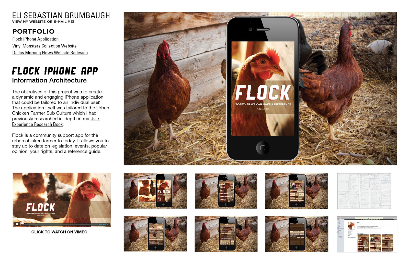
Flock is a community support app for the urban chicken farmer to today. It allows you to stay up to date on legislation, events, popular opinion, your rights, and a reference guide.
• Stay informed of local legislation meetings in your area to quickly mobilize with the Alerts feature.
• Create and register to attend events organized by skills and experience in which you can chose to be the teacher or the student.
• Give and receive feedback on popular opinion in your area using the Polls.
• Have access to a legal reference guide to always have your rights as an urban chicken farmer at your finger tips.
• Contribute to and benefit from the user created Learning Center, a database of urban chicken farmer necessities.
• Customize your user profile to reflects your areas of expertise, experience, and dedication.
May 2, 2012
ADAA
Here are my first four entries into the Adobe Design Achievement Awards. I plan on submitting more than just these four but this is the start.
Chocolove 100% Guilt Free Chocolate
Chocolove is a product re-design using an alternative mode of appeal. The original being a solely pathos based product has be re-designed into a primarily logos and secondary based pathos product. I wanted Chocolove to allow the viewer to know that it was going to taste as good as it was for them to eat. To do this I created a corresponding infographic of ingredients. There is a corresponding icon set to reinforce the benefits of chocolate and several interesting facts on the front cover.
The objective of this project was to re-design an existing product package, using an alternative “mode of appeal”. Chocolove was initially a pathos based product. For the purpose of this project I re-designed it to be based on a logos mode of appeal.
6" x 3"
To create Chocolove I used Adobe Illustrator CS5. Using Illustrator I was able to create clean professional vector based graphics that really allowed my product to stand out on the shelf and in the classroom.
---------------------
Shigeo Fukuda Lecture Poster
Lecture poster for Shigeo Fukuda's free lecture "A Playful Heart" in the Epperson Auditorium. This poster was created in Fukuda's spirit and passion for illusion and repetition that he used in his own work. This was created using a tilt shift technique in Photoshop CS5 and a mirror image of the Vanderslice Hall building at the Kansas City Art Institute.
The objective of this project was to create a poster for a hypothetical design lecture at the Kansas City Art Institutes Epperson Auditorium featuring Shigeo Fukuda. The style of the poster was to be inspired by the artist themselves.
24" x 36"
Using Adobe Photoshop CS5 I was able to create a design lecture poster in the spirit of Shigeo Fukuda using illusion and repetition techniques like tilt-shifting and mirroring. Photoshop CS5 also allow me to seamlessly integrate the two images together to create a poster to honor Fukuda's memory.
---------------------
Union Station Interactive Timeline
The purpose of the project was to create a timeline for public touchscreen use with both linear and non-linear elements to accompany an exhibit on the 100-year history of Kansas City’s Union Station focusing on one decade’s worth of content as a proof of concept.
The goal of this project was to interpret principles of 2-d design within temporal media. Construct messages over time that address stated communication objectives. Explain the differences between simultaneous and sequential communication. Apply knowledge of narrative, its manipulation, and application across media in linear and non-linear forms. Apply the communicative potential of the various temporal elements (duration, motion, and transition) and communication channels (image, text, voice, music, sound effects) to further projects.
1280x720
Using Adobe After Effects CS5 we were able to create attractive motion graphics to pair with the designs we had created in Adobe Illustrator CS5 seamlessly. It was some of the first times we had ever used After Effects and it made the process not just possible but enjoyable. We were able to integrate historical documentation, personal accounts using voice recordings edited with SoundBooth, and embody the spirit of such an important American landmark as Union Station into our project.
---------------------
John Pizzarelli Quartet Folly Jazz Series Poster
This hand illustrated poster was selected by jurors from the Folly Theater and Lamar Bilboards as the poster to represent The John Pizzarelli Quartet's upcoming show in Kansas City, Missouri using the rhetorical figure of metaphor.
The objective of this project was to design a promotional poster for the Folly theater jazz series. Author content in a way that best exemplifies the appropriate and creative use of the following rhetorical figures: irony, pun, parody, metonymy, metaphor, allegory, hyperbole, personification, antithesis, synecdoche. Clearly communicate the message for the intended audience and context. And exemplify refined and engaging image making, typography, hierarchy, composition and color sensibilities.
24x36
After drawing my design by hand I was able to scan my work into Photoshop and really pull out my line work. I was able to use Illustrator to live trace my line work and create really clean structure to work with. Next I colored in my line work with live paint that still allowed for a hand made feel.
April 28, 2012
Graphic Design Survival Guide
Hey guys! I have comprised this list based on my experiences so far through my career. I thought it would be helpful to have it all in once place so that I could share it with everyone else. Please feel free to submit new content or corrections to me! I hope it helps!
- Eli
GRAPHIC DESIGN SURVIVAL GUIDE
Portfolio Sites
- First Things First
- Free Portfolio Sites
- Invite Only Portfolio / Networking Sites
- Basic Free Blog / Portfolio Sites
Inspiration Sites
Graphic Design Publications
Networking Sites
Design Memberships
Design Scholarships
Awards and Contests
Forthcoming:
Internship Guide - Coming Soon
- Local Internships Spots
- Portfolio Preparation Digital & Physical
Tutorial Sites - Coming Soon
- Organized by programs
Resource Sites - Coming Soon
- Organized by materials needed
Hosting Your Work - Coming Soon
- Upload Sites Video / Keynote / Etc.
- Hosting Files
Selling Your Work Online - Coming Soon
- Promotion
- Paid Shops
- Free Shops
- Taxes
Freelancing - Coming Soon
Portfolio Sites
- First Things First
- Free Portfolio Sites
- Invite Only Portfolio / Networking Sites
- Basic Free Blog / Portfolio Sites
Inspiration Sites
Graphic Design Publications
Networking Sites
Design Memberships
Design Scholarships
Awards and Contests
Forthcoming:
- Local Internships Spots
- Portfolio Preparation Digital & Physical
Tutorial Sites - Coming Soon
- Organized by programs
Resource Sites - Coming Soon
- Organized by materials needed
Hosting Your Work - Coming Soon
- Upload Sites Video / Keynote / Etc.
- Hosting Files
Selling Your Work Online - Coming Soon
- Promotion
- Paid Shops
- Free Shops
- Taxes
Freelancing - Coming Soon
Portfolio Sites:
First Things First:
Remember to apply the things you already know when building your portfolio site. If you're a Sophomore you should be well aware of the importance of color and form, the basics of Word Press, domain ownership, ftp, and web hosting. If you're a Junior you should also know the importance of wire framing, content organization, typography on screen (desktop and mobile), and navigation. Seniors, you should have all of this refined to an art after Multimedia Experience and Pro-Practice. With that said remember that the purpose of your portfolio is to showcase your work. The design should be in service of that goal.
Please keep in mind that applying what you've already learned this far in design like basic html, css, domain and ftp management it is cheaper than just customizing a paid portfolio site. It may not be as quick and easy but coding but managing your own site shows that you can do it. Learning code is not just for web designers. As a graphic designer you will work with web designers, and developers at times. If you understand the core of their work you will be able to better tailor your own to the needs of the project team. With that said if possible I would highly recommend maintaining a paid portfolio site for the exposure this early in your career and also a personal online portfolio site that will grow with you over the years. Remember that good design and effort shows through very clearly in any online portfolio presence.
* This mark beside the site name denotes that they have bonus networking capabilities. Capabilities that allow you to follow other creatives and possibly expose your work to more people. Some others below in my list offer it but I'm not sure exactly how much traffic they really generate so i've decided to leave them off.
First Things First:
Remember to apply the things you already know when building your portfolio site. If you're a Sophomore you should be well aware of the importance of color and form, the basics of Word Press, domain ownership, ftp, and web hosting. If you're a Junior you should also know the importance of wire framing, content organization, typography on screen (desktop and mobile), and navigation. Seniors, you should have all of this refined to an art after Multimedia Experience and Pro-Practice. With that said remember that the purpose of your portfolio is to showcase your work. The design should be in service of that goal.
Please keep in mind that applying what you've already learned this far in design like basic html, css, domain and ftp management it is cheaper than just customizing a paid portfolio site. It may not be as quick and easy but coding but managing your own site shows that you can do it. Learning code is not just for web designers. As a graphic designer you will work with web designers, and developers at times. If you understand the core of their work you will be able to better tailor your own to the needs of the project team. With that said if possible I would highly recommend maintaining a paid portfolio site for the exposure this early in your career and also a personal online portfolio site that will grow with you over the years. Remember that good design and effort shows through very clearly in any online portfolio presence.
* This mark beside the site name denotes that they have bonus networking capabilities. Capabilities that allow you to follow other creatives and possibly expose your work to more people. Some others below in my list offer it but I'm not sure exactly how much traffic they really generate so i've decided to leave them off.
Free Portfolio Sites:
*Behance Network / Free - Regardless if you have another portfolio site you should be on here for the exposure and networking possibilites. http://www.behance.net
Indexhibit - You must know some basic HTML and have your own hosting. Indexhibit can be coded to resemble Cargo Collective if you want that look without the same price. http://www.indexhibit.org/
*Coroflot - Lists portfolios by school as well. It would be great to see more KCAI representation. No html knowledge needed. - http://www.coroflot.com/
Carbon Made / Free - The free version is limited to 5 projects and 35 images. No html knowledge needed.
Krop / Free - The free version is limited to 10 images and a basic template - http://www.krop.com/creativedatabase/
Gigposters.com - On a side note if you make gig posters make sure you're on this site: http://www.gigposters.com/
Paid Portfolio Site:
*Cargo Collective - http://cargocollective.com/
Basic usage is free. Templates, and projects are limited.
To apply: http://cargocollective.com/#/contact
Paid is: $66/year or $9/month.
*Behance Prosite / Paid - $11/month. - No programming required to update the site. Like Behance, minus the Behance branding. - http://www.behance.net/prosite
Carbon Made / Paid - $12/month. http://carbonmade.com/
Krop / Paid - $10/month. The paid version is unlimited images, gallery, custom domain, etc.
Invite Only Portfolio / Networking Sites:
*Dribbble - http://dribbble.com/
*Forrst - https://forrst.com/
Basic Free Blog / Portfolio Sites:
PHP & MySQL Based. Highly recommend basic knowledge of PHP and MySQL database management to make them really worth while unless you want to shell out for templates.
*Tumblr - Any blog built on the Tumblr format can be tricked out into a decent design portfolio but it will require a good understanding of the code to do it. Otherwise you find yourself having to purchase templates to make it look half decent.
Wordpress.org - Wordpress has greater customization installed on your own hosting. http://wordpress.org/
Wordpress.com - They host it free with less customization - http://wordpress.com/
Drupal - Option... I would stick with Wordpress (self-hosted) if you have to take this route. http://drupal.org/
Joomla - Option... I would stick with Wordpress (self-hosted) if you have to take this route. http://www.joomla.org/
Inspiration
(e-mail me to add to this list! elibrumbaugh at gmail dot com)
Remember that inspiration is wonderful, but plagiarism won't help you grow at all.
Designspiration - http://designspiration.net/ (Images can be saved with membership)
FFFFound - http://ffffound.com/ (Images can be saved with membership)
Grabbbb.it - http://grabbbb.it/ (Like ffffound.com) (Images can be saved with membership)
Buami - http://www.buamai.com/
Design Envy - http://designenvy.aiga.org/
But Does It Float - http://butdoesitfloat.com/
Under Consideration - http://www.underconsideration.com/
Reform It - http://reform.lt/
Design Work Life - http://www.designworklife.com/
Design Defined - http://designdefined.co.uk/
The Solid Studios Blog - http://blog.thesolidstudios.com/
Visual Graphic - http://visualgraphic.tumblr.com/
Nice Things - http://nicethings.me/
Creattica - http://creattica.com/
This is Colossal - http://www.thisiscolossal.com/
Fonts In Use - http://fontsinuse.com/
Oh Beautiful Beer - http://www.ohbeautifulbeer.com/
Digital Arts
Creattica - http://creattica.com/
This is Colossal - http://www.thisiscolossal.com/
Fonts In Use - http://fontsinuse.com/
Oh Beautiful Beer - http://www.ohbeautifulbeer.com/
Graphic Design Publications:
This list does not include the many mixed design / photography / architecture / fashion magazines.
They are also great for inspiration!
This list does not include the many mixed design / photography / architecture / fashion magazines.
They are also great for inspiration!
Remember that many of these accept submissions from students!
Computer Arts
- Arts Projects
- Illustrator
- After Effects
- Inspiration Ed.
Computer Arts Collection's
- Graphic Design
- Typography
- Illustration
- Branding
- Photography
- Advertising
- Arts Projects
- Illustrator
- After Effects
- Inspiration Ed.
Computer Arts Collection's
- Graphic Design
- Typography
- Illustration
- Branding
- Photography
- Advertising
Communication Arts
IdNDigital Arts
Creative Quarterly
HOW
GD USA
Print
.Net
I.D.
CMYK
HOW
GD USA
.Net
I.D.
CMYK
Networking Sites:
*LinkedIn - A great online resume! It allows you to network other people in any field. Its hard to keep track of everyone you meet at events so let LinkedIn do it for you. It also allows you to embed your Behance portfolio into it. It also informs peers and possible employers of your internship progression while you're still a student. http://www.linkedin.com/
Design Memberships:
AIGA KC (American Institute of Graphic Arts) - No seriously. Get on it. It pays for itself. Make you sure you attend the events and if possible volunteer to work them! http://www.aigakc.org/
AAF-KC - Join if you're really into advertising or just want a great chance to network with some really great people already in the field. They also offer a student scholarship currently worth $2000 a year to several students yearly. Don't miss it! http://aafkc.com/
Design Scholarships:
http://www.aiga.org/worldstudio-scholarship/
- Basic scholarships are awarded in the amounts of $2,000–$3,000.
- Up to two additional awards may be given in an amount up to $5,000 at the jury’s discretion.
- Honorable mention prizes in the amount of $500 cash are also awarded.
http://aafkc.com/ad-club-foundation
- Financial assistance of $1,000 per semester
- One-year support and counsel of a mentor from the membership of the AAF-KC
- One-year membership in AAF-KC
- Invitations to attend all regular program activities of AAF-KC at no cost while in school (excludes annual ADDY Awards show)
- All AAF-KC mailings/emails
- Membership in the American Advertising Federation
Art Directors Club
http://www.adcglobal.org/education/scholarships/
- $2500 Veer Scholarship in Advertising
- $2500 ADC Scholarship in Advertising
- $2500 ADC Scholarship in Illustration
Awards & Contests:
- AIGA A's - http://www.kcdesignawards.com/ - $15 Student
- Above the Fold - http://awards.abovethefoldbook.com/ - $10
- Addys - $35 Student AAF-KC Members or $45 Non-Student Members
- Creative Quarterly - $10
- CMYK Magazine - http://www.cmykmag.com/ - $45 (Unlimited entries after base cost)
- Communication Arts - http://www.commarts.com/competitions - $40 Single Entry / $80 Series
- ADC - http://www.adcawards.org/ - $35 Student (There is a School Discount: Enter 10 or more pay $25 per entry. To qualify all items must be entered by an individual administrative account.)
- Core 77 - http://www.core77designawards.com/ - $60 Student
April 27, 2012
Flock Adjustments
Keynote Order:
iPhone w/icon displayed.
Flock loading screen.
Outline loading screen comparison to show what it would look like for a new user.
Home Screen.
Profile (user view) - Only the user see's their own profile this way?
Profile - Edited by user / Updated experience level.
Events. - User picks an event to read about.
Events Details.
RSVP Conformation Popup.
Context shot - Person at an urban chicken meet up where they mention that everyone should rsvp for the events / specific workshop upcoming about local legislation.
iTunes might be at the end.
Things to build out still:
- iTunes Page
- Context shot
- iPhone screen
- Outline loading screen
April 26, 2012
April 23, 2012
10 Principles of Mobile Interface Design
http://www.netmagazine.com/features/10-principles-mobile-interface-design
Just a little find and share about some good mobile design tips.
April 22, 2012
Nelson-Atkins User Testing Day Reflection
The user testing at the Nelson was extremely informative and I'm really glad we were able to have a chance to really kid / parent test these before we present them to the Nelson.
A few things I noticed that we need to work on the map labels and map clarity. Working as small as we are has been pretty tricky but we'll get it. We also have to give the parent more direction on how they can utilizes the map best. There was some disconnect about where the parent should start the proces of the map. The kids kept going to sculptures that were not on the map. In this case the parent gave both of her two kids the two maps and let them direct themselves. The parents really appreciated the labels on the badges because it simplified the information that was on the card which the kids didn't have the patience to read the whole card. The kids loved the badges and couldn't get enough of them. They started to run to sculptures that didn't even have badges for them. Again a clarity issue we will resolve. They started flipping through the booklet now to see which ones they did need so that was good. The parent really appreciated the order of events in the booklet, the legibility of the type, the amount of information and content, she appreciated the simplicity of the information layout. Michele, had mentioned to me that the prize badge should be larger than all of the others so that they can wear it in the parade and understand the importance of it above the others. I plan on re-designing the badge styles to give a softer feel. The level of incentive was off the charts I felt. We just have resolve some of our issues and tighten everything up. I feel pretty confident about it moving forward.
Keynote Adjustments Progress
We are currently working on implementing these new screens:
Our Goals.
Typeface selection - During research.
Testing process.
Issues we resolved.
iPad app as a design solution.
Wireframing.
iPad Context with icon.
The new screens from before last presentation and the last / near final:
Subscribe to:
Posts (Atom)


