SARA RAHBAR
Is a contemporary artist living and working in New York
"We left our woes behind, with only echoes of our previous lives remaining. Seeking continuation, time and refuge, human beings attempting to survive our selves, our lives, and our present locations.
Metamorphosing and transforming for the means of surviving it all, our foundations lay, but our houses have burned to the ground. Building castles in the sky, for a species that cannot fly, brick by limb we tear it down. Thinking that we are moving forwards, yet moving backwards all along.
Gajar woman and golden toys, we wait for dawn."
Portfolio Link
October 7, 2010
October 3, 2010
50 Iconic Book Covers (Link)
Great collection of inspiration. Check it out.
50 Iconic Book Covers
"In no particular order, AbeBooks presents 50 iconic book covers that we love. If you saw these particular editions in a bookshop window, then we believe you would stop and stare. Most have been around for some decades, some are very famous, some were famous, and a few have been forgotten. Every one is all worth a second look."
50 Iconic Book Covers
"In no particular order, AbeBooks presents 50 iconic book covers that we love. If you saw these particular editions in a bookshop window, then we believe you would stop and stare. Most have been around for some decades, some are very famous, some were famous, and a few have been forgotten. Every one is all worth a second look."
October 1, 2010
Film Canister Font Post Crit + Photochop Adjustments
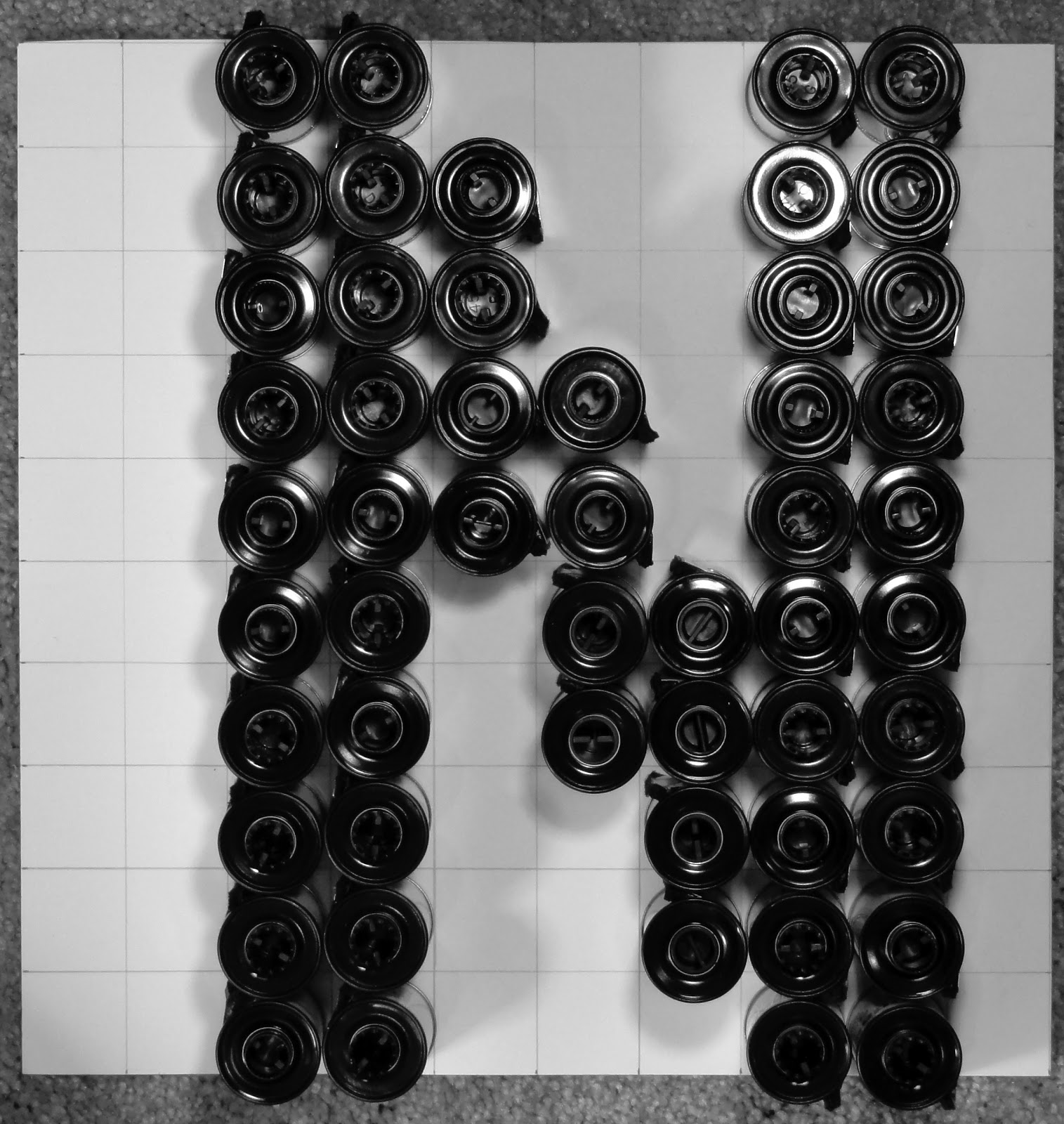
After meeting with my group and Marty I have decided to use my Film Canister Bold as my font of choice.
Before
After // Added another roll of film to the far right curve in the B
Before
After // Added another row of rolls to the stem in the H and removed part of the stem under the Median line.
Before
After // Added another row of rolls to the stem of the K
September 30, 2010
Find + Share // Paintings by Gudrun Åsling
I ran across these interesting paintings by Gudrun Åsling which relate quite well to what we've been doing in Visual Communications.
"Art is a simile of the Creation. Each work of art is an example, just as the terrestrial is an example of the cosmic"
September 28, 2010
Helvetica Response / Other Film Suggestions
"Graphic Design is the communication framework through which these messages about what the world is now, and what we should aspire to. Its the way they reach us. The designer has an enormous responsibility. Those are the people, you know, putting their wires into our heads" - Rick PoynorHelvetica, the film does a great job of not only explaining the interesting background behind the font's creation but also the aspects in which type can be used properly and improperly. As well as the underlying and often overlooked reason of why we're designers and the responsibility we have as designers.
This movie in closing makes a really good point about how social networking is changing the world by allowing everyone to customize their personas on the internet. Through this customization people are starting to be come more aware of design in the world around them on such a grand scale that it could very well change a great deal of the direction in which design in a whole is moving. i.e. Design for change.
One of my favorite quotes from this movie:
"It's very hard to do the more subjective, interpretative stuff well. I can teach anyone from the street how to design a reasonable business card, newsletter, but if I bring the same group of the street in and play a CD and say, OK, let's interpret that music for a cover, well, 9 out of 10 people will be lost, and they're gonna do something really corny and expected, and one person's gonna do something amazing because that music spoke to them and it sent them in some direction where nobody else could go, and that's the area for me where it gets more interesting and exciting, and... more emotional, and that's where the best work comes from." - David CarsonHelvetica is one of those movies that I watch when I'm feeling uninspired and just need a real jumpstart. The excellent Album Leaf soundtrack doesn't hurt at all either.
A few other films I keep in my design jam rotation I would recommend to anyone who enjoyed Helvetica:
"Objectified, is a feature-length documentary about our complex relationship with manufactured objects and, by extension, the people who design them. In his second film, director Gary Hustwit (Helvetica) documents the creative processes of some of the world's most influential product designers, and looks at the creativity at work behind everything from toothbrushes to tech gadgets. What can we learn about who we are, and who we want to be, from the objects with which we surround ourselves?"
"Beautiful Losers, an endearing film about a tight-knit group of artistic friends borne loosely out of a legendary, now-defunct New York gallery called Alleged, heightens one's awareness of how cultural scenes can be forged and maintained through long-term documentation. Since the beginnings of this group in the early 1990s, filmmaker, curator, and ex-Alleged director Aaron Rose has undertaken the gargantuan task of forming and chronicling an American artistic community through museum shows, an art catalog from which the Beautiful Losers film borrows its name, and finally, a full-length feature documentary. Anyone who hasn't yet learned of the historical roots and aesthetic connections between graphic designers like Geoff McFetridge, filmmakers like Harmony Korine and Mike Mills, and street artists like Shepard Fairey and Barry McGee will now be exposed to this highly influential posse of creative people who have infiltrated mainstream media and advertising to renovate commercials, print ads, and art practice sponsored by corporate entities."
"Dithers is a "visual commentary" about contemporary American art, Dithers profiles thirty innovative US-based artists with an emphasis on graffiti, skate subculture and graphics. Followers of urban art will recognize many of the names, including Seen, Quik, Stash, Zephyr, Shepard Fairey, Dave Kinsey, and Ricky Powell; in addition, the DVD profiles emerging talents such as Bigfoot, Sam Flores, Jeremy Fish, David Choe, Dalek, Andy Howell, Dug One, Giant, Tiffany Bozic and others. Giving plenty of room for the artists to discuss their work, plus visual references of their art, Dithers is watchable and insightful all around."
September 27, 2010
Pantone + / - Emotional Responses
Bright Red 186 - Angry, Frustrated, Hot, Radiant
Vibrant Orange 1585 - Excited, Glowing, Vibrant
Bright Yellow 116 - Passionate
Earth Brown 438 - Safe, Protected, Secure, Hidden
Deep Blue 2747 - Sad, Worried, Depressed, Uncertain
Chartreuse Green 584 - Curious, Forgiving, Sincere
Blue Purple 267 - Crestfallen, Melancholy
Charcoal Gray 425 - Worn, Tired, Dying
White - Scared, Cold
Black - Vapid, Concerned, Afraid
Photo Color / Studies - Books in Enviroments
Here are my first round of photographs for our photo color / studies. I will be narrowing these down after I take many more into a cohesive collection.
My theme is Books in Environments.
The books I purchased from half price books particularly for their cover colors.
These are mostly outdoors but I plan on taking them into cafe's, and other kinds of stores as well.
I plan on burying, and suspending some in different color settings.
POST CRIT: Remember each page is a different color relationship. Get rid of the covers and print out color sheets to replace them with. 8 Covers total now. Watch for cropping in images when I shoot them. Make sure backgrounds are effective as part of the composition and part of the color wheel.
Subscribe to:
Posts (Atom)