March 28, 2013

Dieter Rams, Week 4

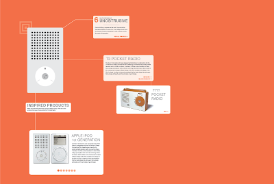
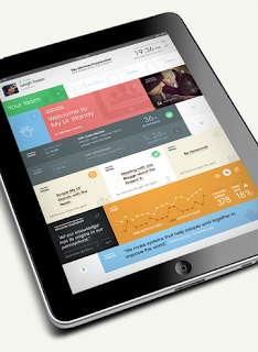
Since our last update we have updated our branding, fleshed out our wall screens and added new interactions, have a new iphone layout, and table screens that include AR markers. Overall we have simplified the branding and style across the board in Rams' style. 

updated branding


wall screens
Inactive State
Single View
Single View
Side by Side Comparison
Detail View

Context

iphone


table screens


March 27, 2013

Degree Project - Week 9


Currently I am working on the last 25% of my design work and will soon transition into the presentation phase. I will be working with an animated keynote, poster hopefully, and website. 

March 13, 2013

Degree Project - Week 7


Mom/Entrepreneur User Persona Feedback: "We have a private moms group where we feel comfortable discussing issues that pertain to moms, that we don't want everyone else reading. We plan play dates on here, birthday parties, etc. It would be nice to have more info on local activities so we wouldn't miss things. ie, (baby name witheld) LOVES Winnie the Pooh, and I found out one of the theaters did a winnie the pooh play. I was really disappointed we didn't know about it in time."

"it's nice to have an outlet to rant or ask questions or have discussions about parenting. in our moms group, we have each shown our weaknesses, and have found that we can trust each other. none of us claims to be perfect. an interesting note- i see 5 of these moms regularly, have met a few others once or twice, but the majority of them i've never met."


^ Better viewing order than Blogger. 


INSPIRATION:


March 10, 2013

Spatial Dieter Rams, Week 2

This week we decided to expand our system a little further than just wall screens. While these will still exist in the exhibit, we've decided to add interactive table screens as well. Here's the functionality of each:

Wall:
  • Side by Side comparison.
  • Single view.
  • Detail view.
  • Flip view.
  • giant interactive wall screens
  • before approached, zoomed in detail shots - zooms out as you approach?
iPhone:
  • All items featured in the exhibition. - lock/unlock - take photo to unlock 
  • Map of where everything is. 
  • Story/Narrative behind the show.
  • Bio of Rams.
  • Augmented Reality (See bellow)
Table Digital: (Design: clean white with nothing on it minus the Rams styled AR marker)
  • (iPhone Main Function #1) You sat the phone down and whatever object is on the phone springs to life on the table. Supporting information pops up next to it.
  • (iPhone Main Function #2) - You can hold up the phone to the table over the AR markers and the objects themselves pop up on the table (through your screen). You can move the phone around to see them in full 360. 
  • Shows inspired projects
  • Shows 1/10 principals. Each product has 1 of 10 principals. Encourage people to view all 10. Includes a link to all 10 if they choose too view them all.
  • Related Rams products

We've also decided to reduce the exhibition space to the first floor alone. Here's our location plan for the screens and tables.


The 10 items featured in the exhibition:


Our concept still focuses on Rams' products inspring modern-day products, but we've decided not to limit ourselves to only one product. Here's some examples. We've also narrowed the exhibit to Dieter Rams electronic products with a focus on the surface and interface.


We thought it might be interesting to have the wall screens (before approached) show zoomed in, detailed shots of the products and their interfaces, so to further emphasis the exhibits focus. Here's some examples of zoomed in, detailed shots:


We've begun exploring the interactivity of the table screen. Here's a rough mock-up of how it may look. The + symbols are clues to where viewers can use the augmented reality feature on their phone. The first image shows the design in detail, and the second shows the entire table view.


We've also begun exploring some design options for the iPhone component with the flat style we're going for:


March 8, 2013

Assessment

Spatial has been a class of what I would have to say full of surprise. At first glance I thought we would be focusing on general things we had yet to cover in the course of our studies here at KCAI like wayfinding, exhibition design, and later monument design. Out of ignorance at first glance I didn't think to see the greater value in these studies. As someone who is greatly interested in user experience and Interface design I have been pleasantly surprised at home much this class actually informs the aspects of design I am interested in. Just as easily as we can apply our considerations to spatial design we can also apply them to one person's experience interaction with anything from app to exhibition. The exhibition design at the Rock and Roll museum was also extremely informative because it took into account interaction design and user experience in a spatial and digital realm. I will be the first to admit my short coming in this area. I have a difficult time focusing myself on things like exhibition design and way finding but this class has been very helpful in giving me a chance to look at it in a entirely new light.

March 6, 2013

Degree Project - Week 6


New updated wireframes with current scenarios. Experimenting with functionality and possible points of interaction. 


Based on those digital wireframes I have created the following: 

  • Logging into the app.
  • Setting up with FB or Twitter will allow them to immediately see how the app functions.
  • The tutorial will be able to work with their initial connections from FB or Twitter as an example. Based on my sample these are also the two most common networks.
  • Currently you swipe from screen to screen in this window for the examples of use and introducing function. I plan on replacing this with a more overlaid function inside the app itself.  
  • Setting up initial authorizations.
  • This is a pretty standard function across all applications.  
  • Connecting additional accounts. These are organized by categories.
  • I've decided to take things that walk two lines like Instagram and include it in the Social category. Where something like Flickr I feel would fall into Professional. I feel like showing the accounts that they might not even have helps remind the user that there are other networks out there and they might see content shared from those other networks. 
  • App Home / Function: Hold down to reorder categories.
  • I think I might remove the functions at the bottom. Less visual clutter is extremely important to me for this project and I think I can nest the needed functions in the top menu.  
  • Where the menu exists / reveal quick access to List & Feed. 
  • The Menu allows for quick access to a hidden menu: Allowing you to edit the lists, add new lists, possibly another function i'm still working on, and closing the menu.  
  • Inside the "Favorites" list, the people / connections that form that list are displayed. The number side by side with them is the amount of new "updates" or content that they have shared since you last (viewed them, contacted them, opened the app) - Still experimenting with that.  
  • On the other side of the coin from the Favorites List is the Feed.
  • Think of the List as a quick access to specific people who make up those categories where the feed is the collective "feed" of their combined content.
  • On the left side of this image is showing the quick access to list / feed through a drop down submenu.
  • On the feed itself user content is presented larger because of the selective nature of the feed itself being composed on only people close to you typically any information is intrinsically important to you and thus being worthy of larger screen real-estate. I was a little cautious of this idea at first but so far the outside feedback from P3 and HUGE have been in support of this idea and the psychological importance of those connections reflected in the amount of content allowed in the interface design. 
  • To the left of the content is the photo of that user posting content, their name, in this example the content is from Facebook so it has adjusted the buttons to be "Likes" and "Shares". Based on the outside feedback the idea of tailoring those buttons and functionality to the originating social network is something that will help this stand out. If the content comes from Twitter for example the buttons will change to "Retweet" & "Favorite". The ability to reply and share is Facebook native, where it would be adjusted for the network. 
  • This is not represented currently in these wires but each post will have an icon near it representing where that content originated. It will help explain the button functionality changes. It can also function as a quick link to the original post on FB or Twitter, etc. 
  • On side note some people post to FB using Twitter. Instead of filling your feed with duplicate posts it would know to remove the duplicates immediately. 

  • This is the User Profile screen. This would function as a summery of your connections with this individual. How you're connected, what lists they're on within your app. It would be accessible through their user photo in the feed or in the list of users. 
  • I'm planning on simplifying this profile screen further. I'm not sold on the Call functions for example. I know FB allows you to call people for free and I could run it through that. I just don't know if its worth cluttering up the screen further at this point. 

  • This is two examples of how the user could create a new list.
  • As you start to type the name it would populate with names pulled from all of your connected networks. It would be able to remove duplicates. 
  • On the left version you tap the contacts that you want to add to populate the new list. 
  • Ont he right version you tap the + sign to quickly add or remove people from the list. 

My next step is to start fleshing out the rest of my wireframes, getting them into scenario order, focusing on design, and actual content. Experiment with color, and how it can be controlled by the user.  

Inspiration / Resources:


March 3, 2013

Dieter Rams, Week 1


"The possibilities for innovation are not, by any means, exhausted. Technical development is always offering new opportunities for innovative design. But innovative design always develops in tandem with innovative technology, and can never be an end in itself."

Dieter Rams was often talking about the future of design and how new structures for our behaviors will continuously be necessary as products and technology advances. Today we are recognizing through brands like Apple that his 10 principles are still influencing many design choices today. We decided to continue researching exactly how much modern day products really are being influenced by Rams, and we've decided to frame our concept around this. Here's a breakdown of how we (Ashley and I) imagine our concept working:

Title: 
past / present

Exhibition:
Side by side comparison of his work juxtaposed with a modern counterpart. When not active (by sensor) Rams quotes are displayed that foreshadow the overall concept of the exhibition. (how the best work is timeless, the future of design, etc.)

How:
Interactive walls

Where:
Every wall holds a screen.

Gestures:
You can tap to cycle through the three views: original design, modern counterpart, and a side by side comparison. You can swipe and hold to FLIP the image.

Exhibition layout:
1st and 2nd floor are hold the same type of content.
The pathway of the exhibition is oldest to newest (a timeline of his works overtime).

iPhone/iPad App:
Allows you to interact and explore the functionality of the famous Dieter Rams designs and their modern counterparts on the screen.

iPhone/iPad Distro:
You can download the app on your own iPad/iPhone, or borrow an iPad from the exhibition.

Branding exploration: 


Narrative:
As an industrial designer, Raleigh St. Clair feels that products today are becoming too complicated and too dressed up with extra features. Raleigh has always been a Dieter Rams enthusiast and has preached about Rams' desire to tidy up the world and make it a better place. Raliegh decides to attend the Past / Present exhibition of Rams' work in order to get a closer look at how Rams has influenced certain products today and give Raleigh some peace of mind.

Raleigh enters the exhibition to an introductory screen that introduces the exhibit and advises him to download the exhibit app on his iPhone (or use on of the space's iPads).

As he enters the first room of the exhibit, he soon recognizes that the exhibit is set up in a linear format of earlier works to later works. As he approaches the first screen, a quote slowly fades to a front view of one of Rams' earliest products. Raleigh taps the screen to see this product in comparison to a product today that has been influenced/inspired by the past product. Raleigh takes out his iPhone to interact with the product and get a better feel of how Rams approached the functionality of his products. After he reads more about both products on the wall screen, he continues to the next product in the exhibit.