May 5, 2013

Poetic Final


As artists, we all recognize how fundamental imagination is. as albert einstein once said, “knowledge is limited, but imagination encircles the world.” but imagination should not be something that is limited to children and artists. people should be inspired to use their imagination from day to day. 

The monument of imagination provides everyday people with the opportunity to activate their imagination, allowing them to think as they did when they were children, when elephants could fly and the grass could be any color you wanted it to be. legos are something that people of all ages can directly relate to their childhood. legos were one of the first toys that granted us the ability to create whatever we wanted, as if the building blocks to our wild imaginations. 


Imagination Presentation by Ashley Einspahr

April 29, 2013

Project 3 / Week 3


This week we've basically been messing around with our materials and testing the scale of our lego bricks to our landscape and choosing lego colors. we've chosen our location to be shakespeare garden in central park in new york city because of high traffic and it's located between the MET and the MNS. we've also developed a logo and have been experimenting with the placement of our objects.

April 22, 2013

Monument Concept


"Legos are the building blocks of imagination."
This is a monument to imagination. 


Central Park, my recreating a section of the park we will be able to apply the ability to connect blocks of lego's to it. This will allow visitors to experience a sense of whimsy, and wonderment. 

PLAN OF ATTACK:
  • Buy the basic lego colors of clay. (Yellow, red, blue, and green)
  • Buy or find the tools to carve and paint. 
  • Buy the plants, shrubs, and trees for the park.
  • Buy the benches, lamp pole, trashcan, etc.

BUILDING:
  • Test our hypothesis. Based on the size of the tree we'll determine the size of the blocks, and therefore the dots. 
  • Build the model.

PRESENTATION:
  • Photograph and start Keynote.
  • Finish the Keynote. 

April 17, 2013

Degree Project - Week 12

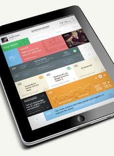
Currently I am in the final steps of adjusting my video, setting the timing, and working on how the assets will be presented. Above is a context shot that I've been posting on Dribbble as I work on the project. 


April 14, 2013

Project 3


Ashley and I have decided to build our monument based on the internet's past, focusing on some of the earliest websites and social networks that are either no longer in use today, or have evolved to something better. The audience for such a monument would vary from people who are comfortable with technology and experienced these earlier websites to computer geeks who enjoy some witty, tech-related humor.

To illustrate this idea, we plan on building an internet graveyard. The graveyard will hold a series of tombstones dedicated to specific websites. These tombstones will be built with regular concrete, but be shaped as computer monitors that are from the specific time period that each website was in use. The computer monitors will each have a screens of the website's past functionality and different pages, almost like an interactive demo. Similar to a real graveyard, these graveyards with show evidence of being visited, some showing that they haven't been visited in years. This will be shown with leave behind gifts by the tombstones that are fitting to the website and the website's audience. For example, the old Myspace tombstone might have a concert flyer taped to it, since Myspace today is only used by bands promoting themselves. 

We'd also like to show the age of the websites by showing some that look extremely dated, while others look freshly buried.

P.S. - We're exited. 

April 10, 2013

Degree Project - Week 11

Working icon.

Currently animating in keynote.

Link to screens coming soon! I have like 40 screens and my photoshop file is about a gig. My computer literally will never forgive me for this project haha. Posting them up soon!

I recently made another round of adjustments and UI tweaks thanks to your input! Thanks Marty!

April 8, 2013

Dieter Rams Exhibition Final


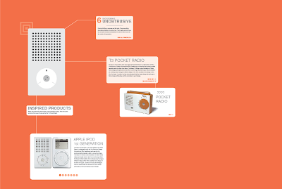
Dieter Rams often speaks about the future of design and how new structures for our behaviors will continuously be necessary as products and technology advance. Today we are recognizing that his 10 principles are still influencing many design choices today through brands such as Apple.

The unspectacular things exhibition focuses on product design by Dieter Rams and how it has impacted product and interface design today. The exhibit lets the viewer look at Rams' products side by side next to its contemporary counterparts in a completely interactive environment, and connect these products with his 10 principles. The aesthetic of the exhibition reflects Rams' style and his unobtrusive methods.

April 3, 2013

Degree Project - Week 10


I've been screen testing with this new app Design Duet which connects directly to the photoshop to display your screens on iPad, iPhone, etc. 

March 28, 2013

Dieter Rams, Week 4

Since our last update we have updated our branding, fleshed out our wall screens and added new interactions, have a new iphone layout, and table screens that include AR markers. Overall we have simplified the branding and style across the board in Rams' style. 

updated branding


wall screens
Inactive State
Single View
Single View
Side by Side Comparison
Detail View

Context

iphone


table screens


March 27, 2013

Degree Project - Week 9


Currently I am working on the last 25% of my design work and will soon transition into the presentation phase. I will be working with an animated keynote, poster hopefully, and website. 

March 13, 2013

Degree Project - Week 7


Mom/Entrepreneur User Persona Feedback: "We have a private moms group where we feel comfortable discussing issues that pertain to moms, that we don't want everyone else reading. We plan play dates on here, birthday parties, etc. It would be nice to have more info on local activities so we wouldn't miss things. ie, (baby name witheld) LOVES Winnie the Pooh, and I found out one of the theaters did a winnie the pooh play. I was really disappointed we didn't know about it in time."

"it's nice to have an outlet to rant or ask questions or have discussions about parenting. in our moms group, we have each shown our weaknesses, and have found that we can trust each other. none of us claims to be perfect. an interesting note- i see 5 of these moms regularly, have met a few others once or twice, but the majority of them i've never met."


^ Better viewing order than Blogger. 


INSPIRATION:


March 10, 2013

Spatial Dieter Rams, Week 2

This week we decided to expand our system a little further than just wall screens. While these will still exist in the exhibit, we've decided to add interactive table screens as well. Here's the functionality of each:

Wall:
  • Side by Side comparison.
  • Single view.
  • Detail view.
  • Flip view.
  • giant interactive wall screens
  • before approached, zoomed in detail shots - zooms out as you approach?
iPhone:
  • All items featured in the exhibition. - lock/unlock - take photo to unlock 
  • Map of where everything is. 
  • Story/Narrative behind the show.
  • Bio of Rams.
  • Augmented Reality (See bellow)
Table Digital: (Design: clean white with nothing on it minus the Rams styled AR marker)
  • (iPhone Main Function #1) You sat the phone down and whatever object is on the phone springs to life on the table. Supporting information pops up next to it.
  • (iPhone Main Function #2) - You can hold up the phone to the table over the AR markers and the objects themselves pop up on the table (through your screen). You can move the phone around to see them in full 360. 
  • Shows inspired projects
  • Shows 1/10 principals. Each product has 1 of 10 principals. Encourage people to view all 10. Includes a link to all 10 if they choose too view them all.
  • Related Rams products

We've also decided to reduce the exhibition space to the first floor alone. Here's our location plan for the screens and tables.


The 10 items featured in the exhibition:


Our concept still focuses on Rams' products inspring modern-day products, but we've decided not to limit ourselves to only one product. Here's some examples. We've also narrowed the exhibit to Dieter Rams electronic products with a focus on the surface and interface.


We thought it might be interesting to have the wall screens (before approached) show zoomed in, detailed shots of the products and their interfaces, so to further emphasis the exhibits focus. Here's some examples of zoomed in, detailed shots:


We've begun exploring the interactivity of the table screen. Here's a rough mock-up of how it may look. The + symbols are clues to where viewers can use the augmented reality feature on their phone. The first image shows the design in detail, and the second shows the entire table view.


We've also begun exploring some design options for the iPhone component with the flat style we're going for: